El Graeller Rialler
Advertising, Branding, Image, PrintEl Graeller Rialler

El Graeller Rialler
El Graeller Rialler is a Catalan-based catering company whose values are the quality of products and services.
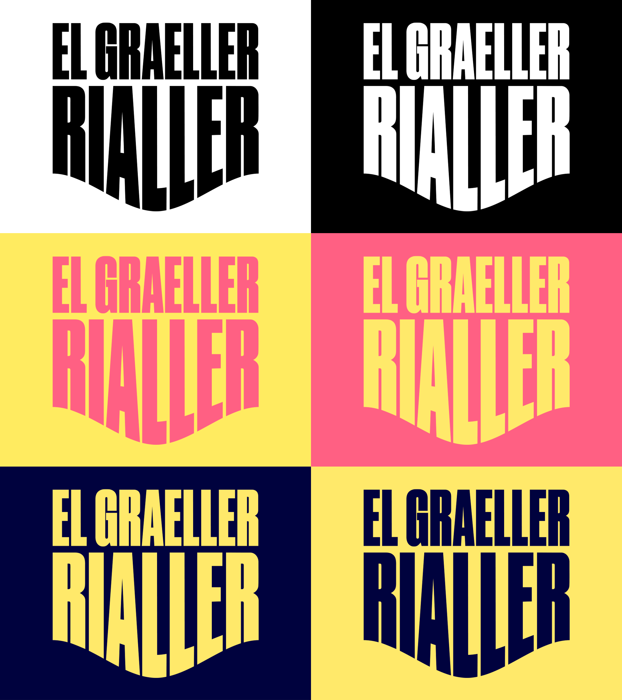
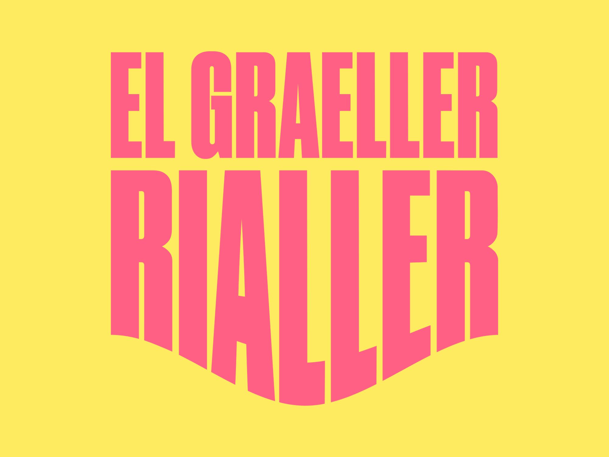
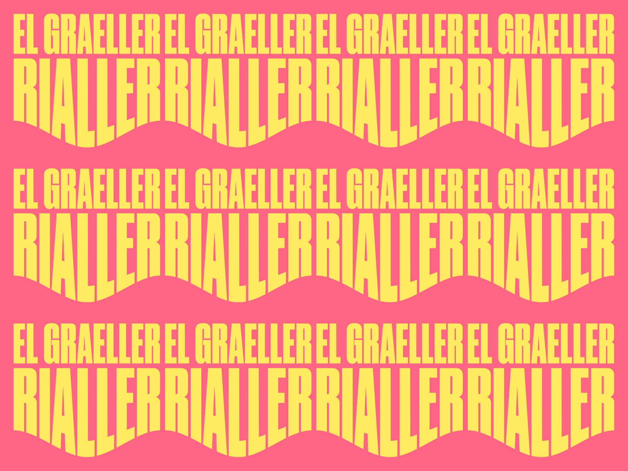
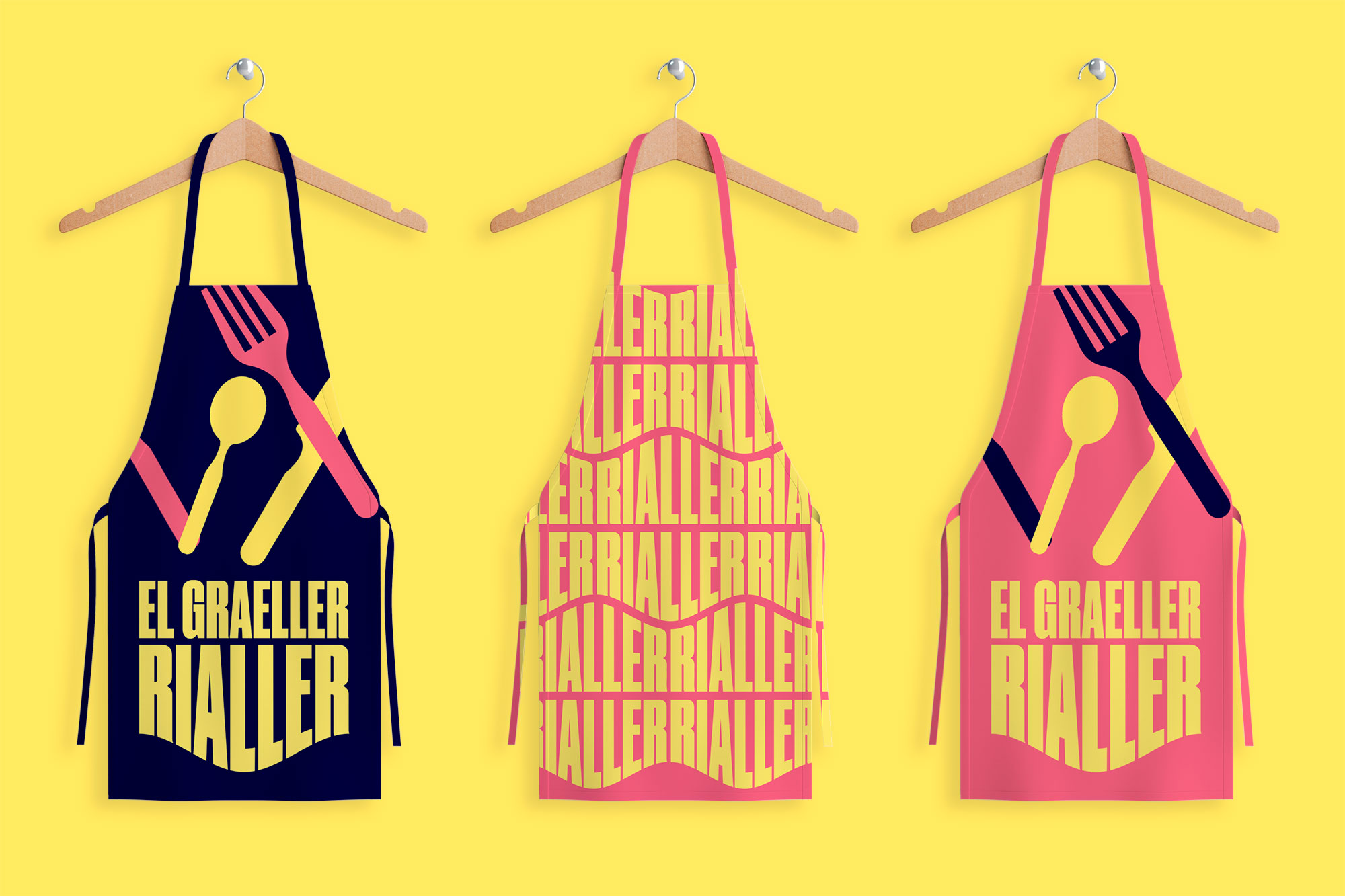
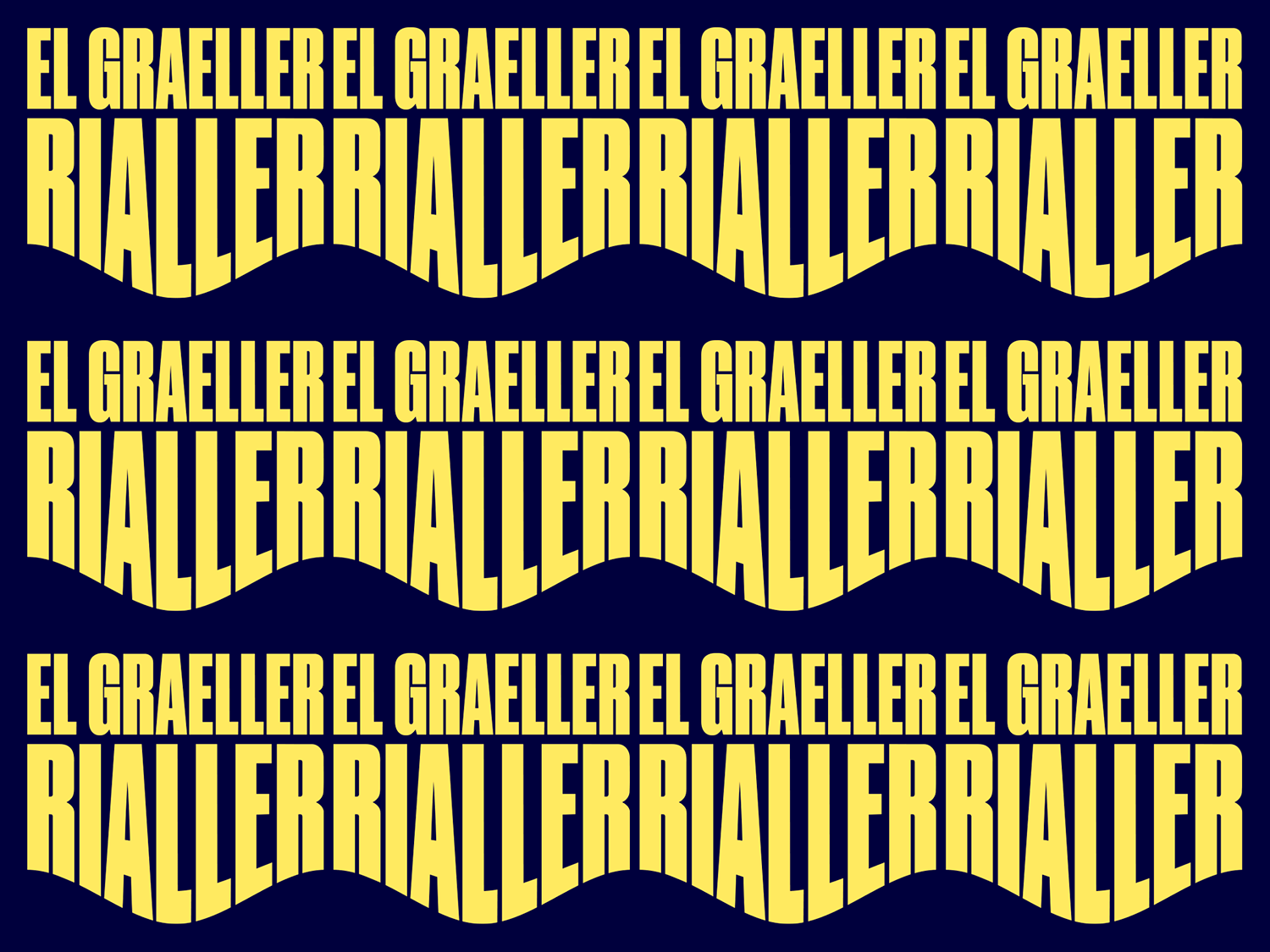
The logo is based on an idea that reflects the verbal component of the naming: El Graeller Rialler (translated from Catalan) is a chef who grills and smiles. In this regard, a solution was found to create a typographic form of the company name in the form of a smile.
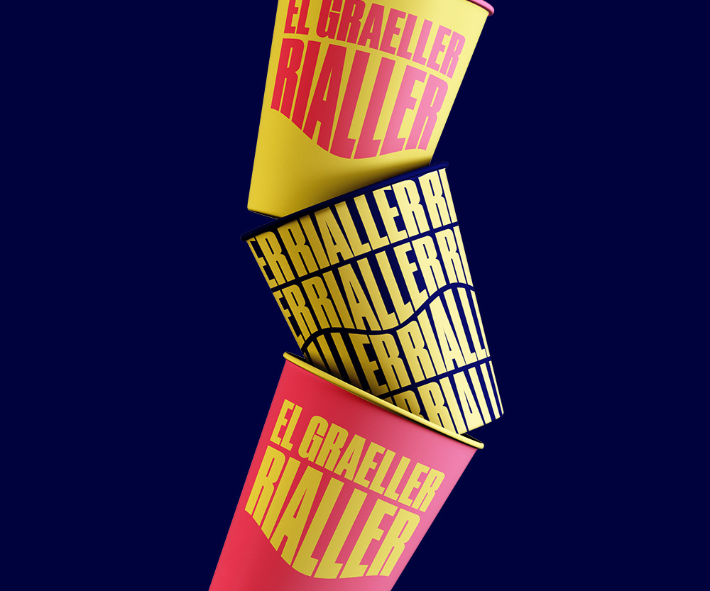
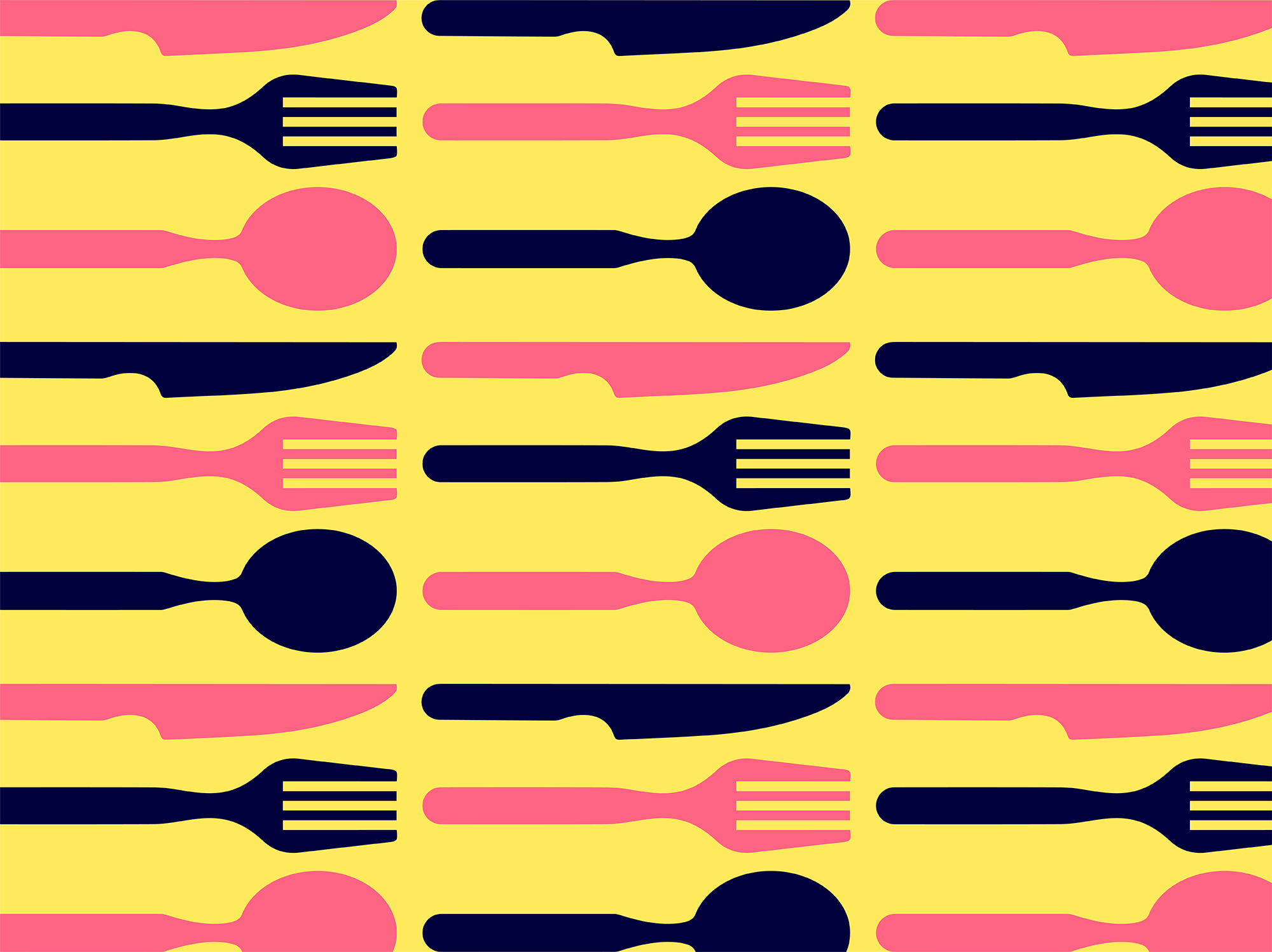
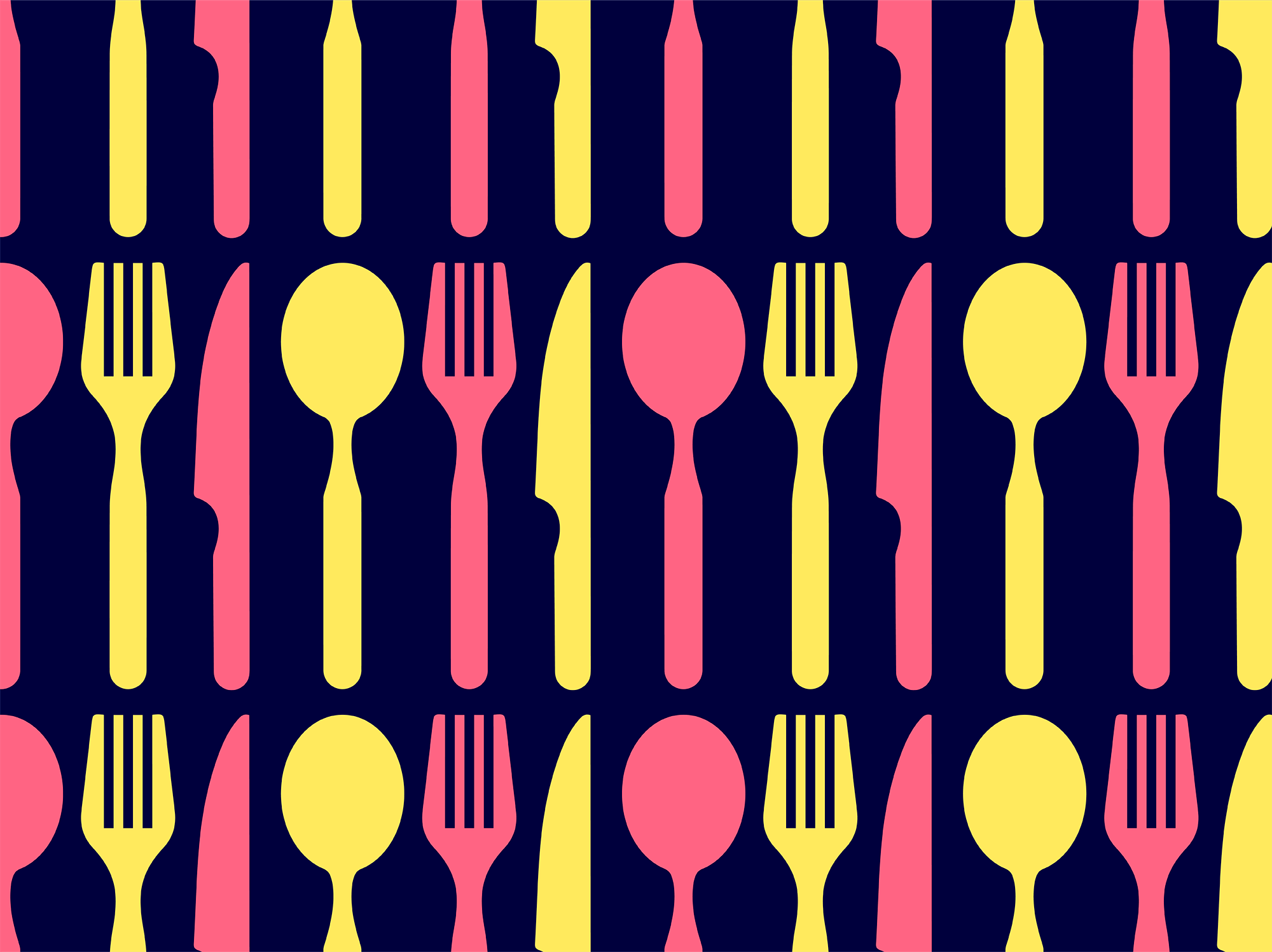
The formed sign found its continuation in a series of patterns that have a transforming character.
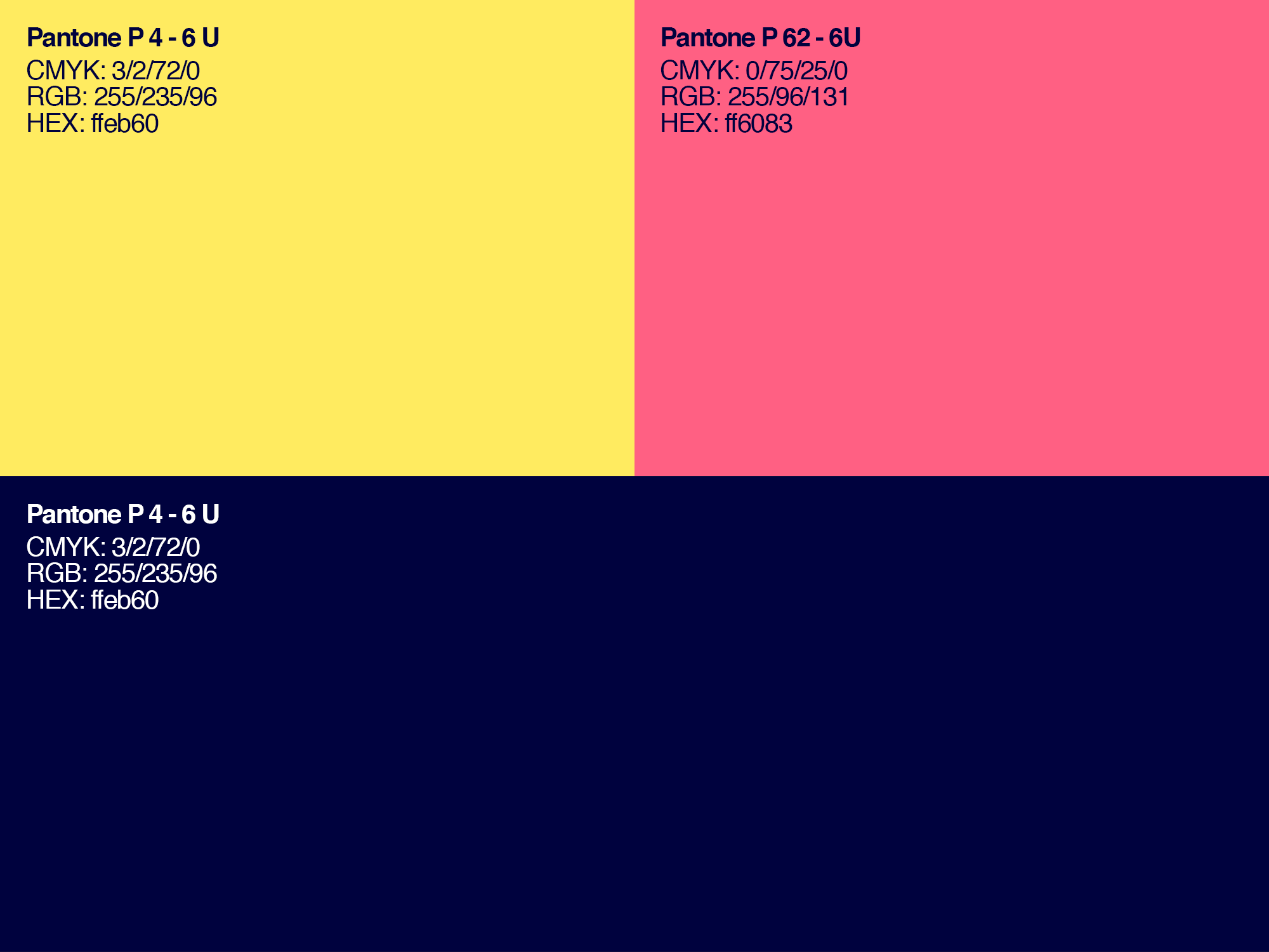
The corporate colors: sandy yellow and salmon pink, which create a positive mood and cheerfulness, as well as deep ultramarine, which enters into contrast and adds brightness and juiciness to warm colors.
As a result, a unique friendly style has developed, reflecting the main idea and values of the company; style with the potential for transformation, flexibility of use and a high degree of memorability and recognition.
Art Director & Graphic Design — Xavier Esclusa Trias
Motion Graphics – Xavier Guinot