Twopots Better business.brands.

Brand Strategy
Creative Direction
A global studio
Wherever the work demands
Scroll
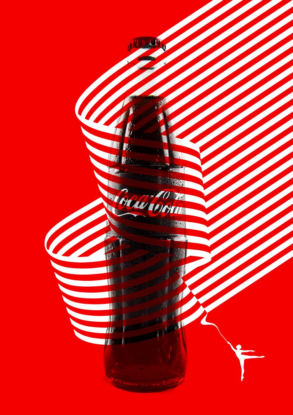
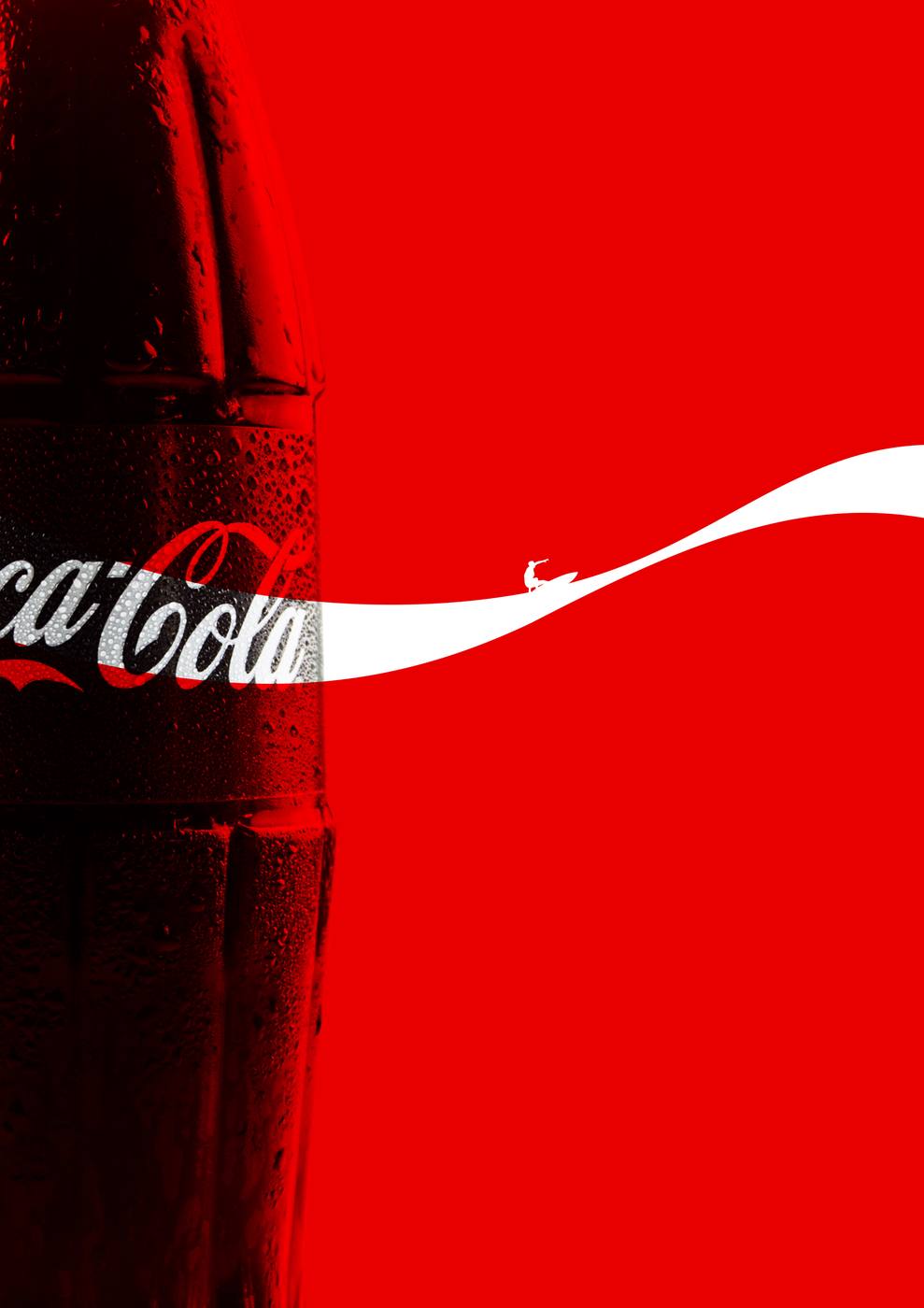
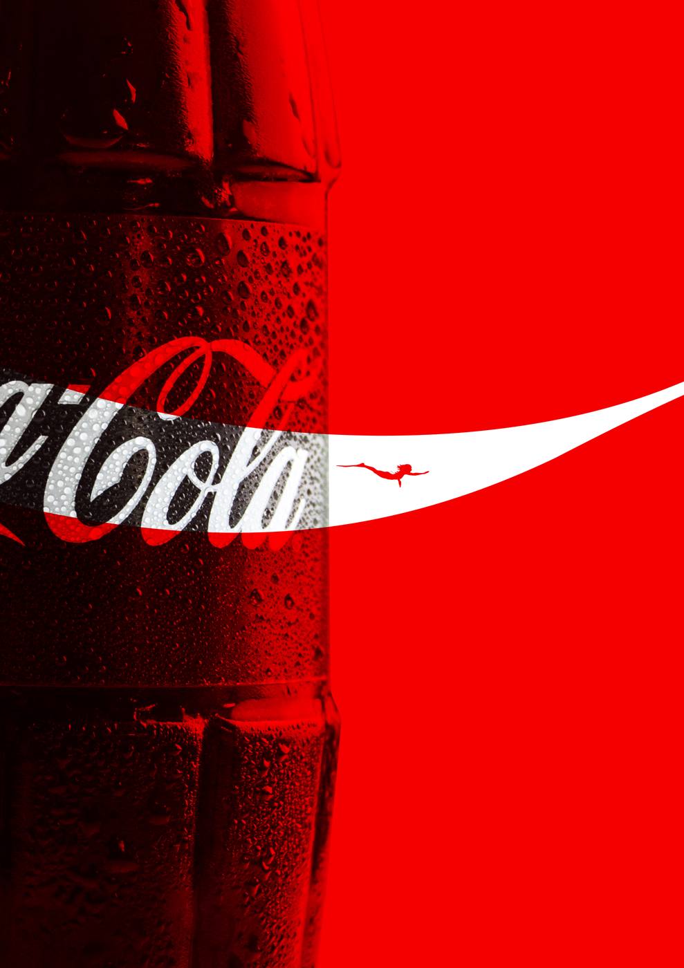
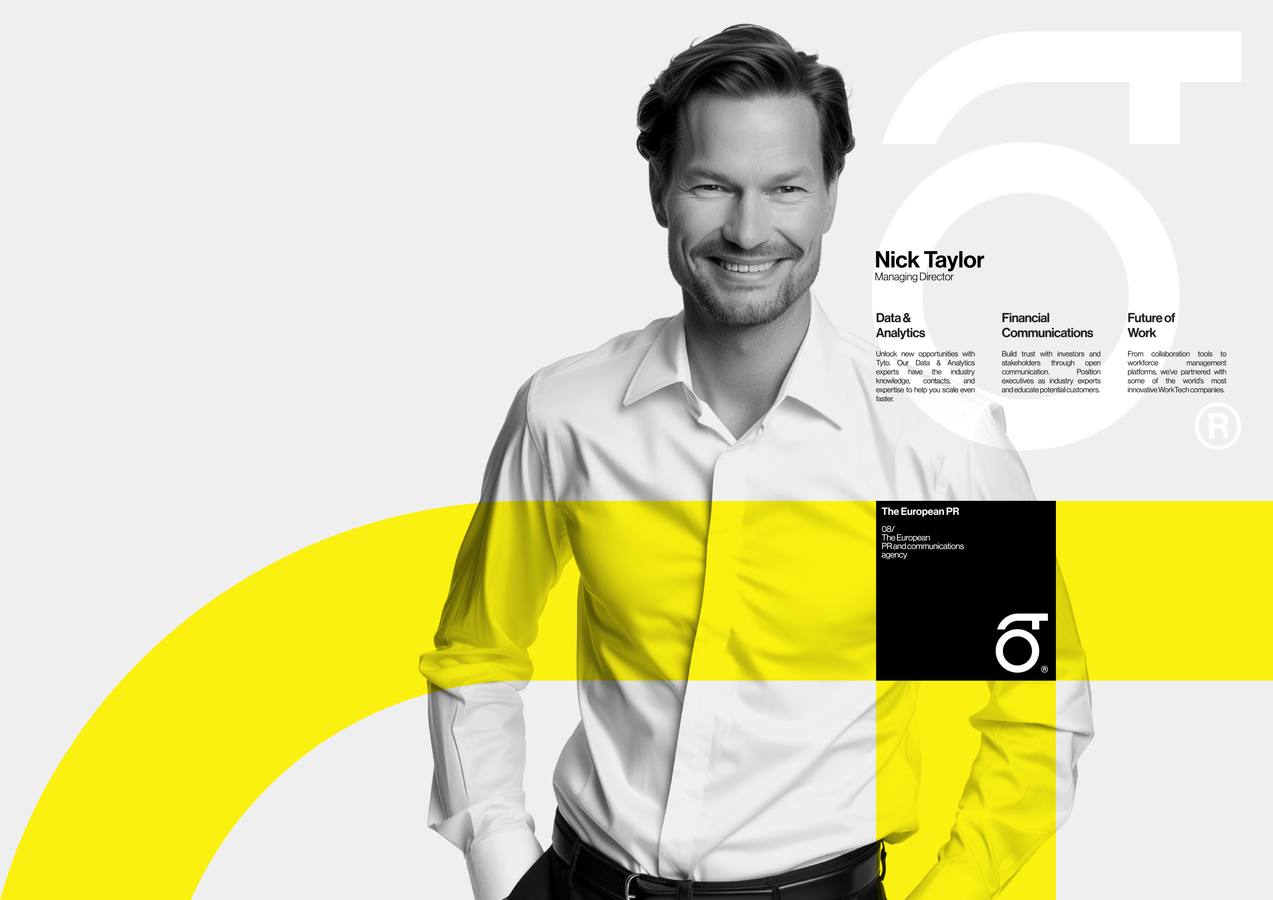
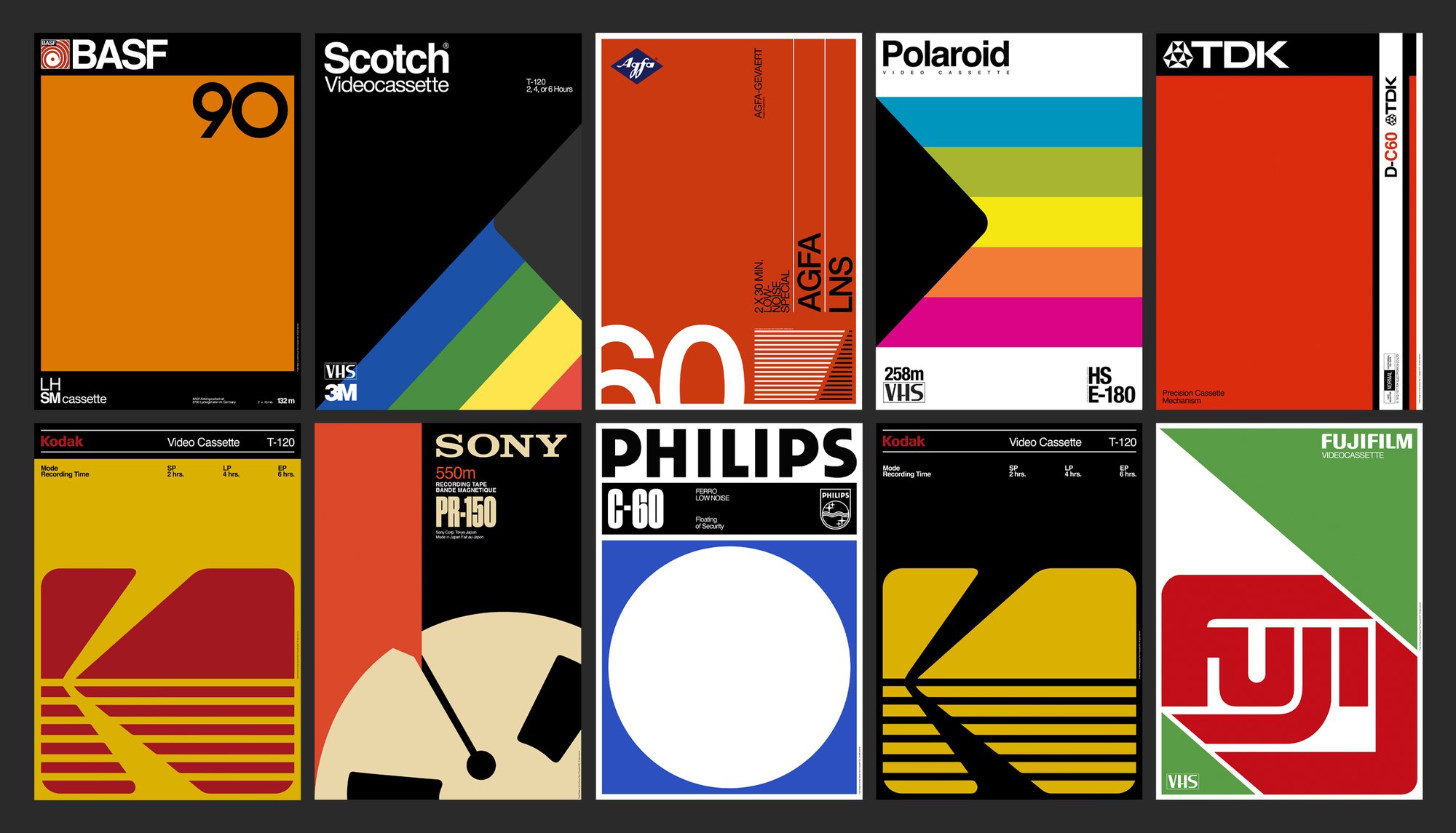
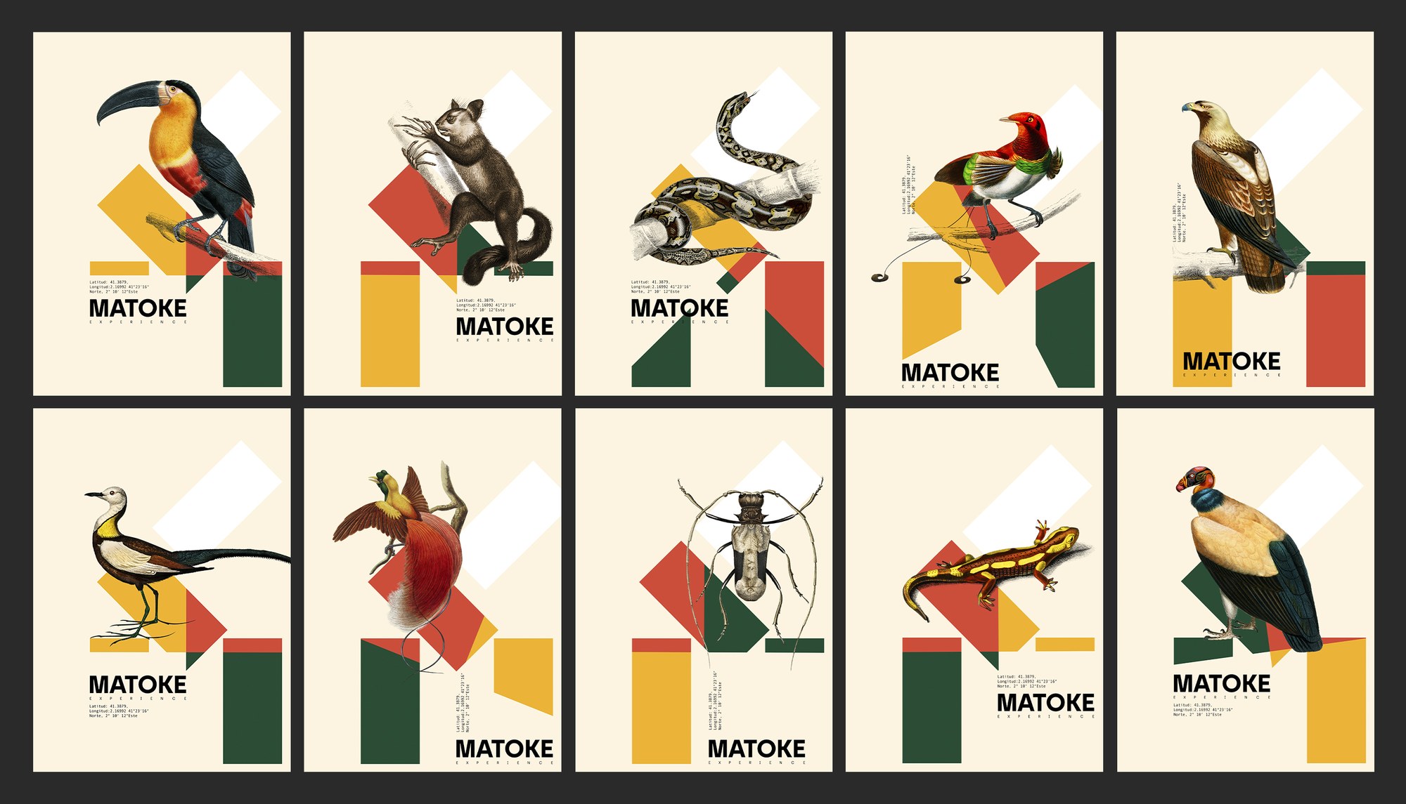
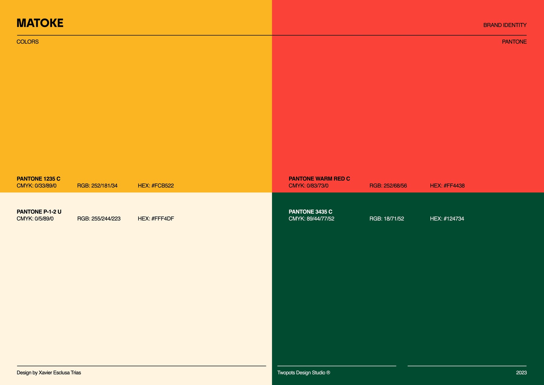
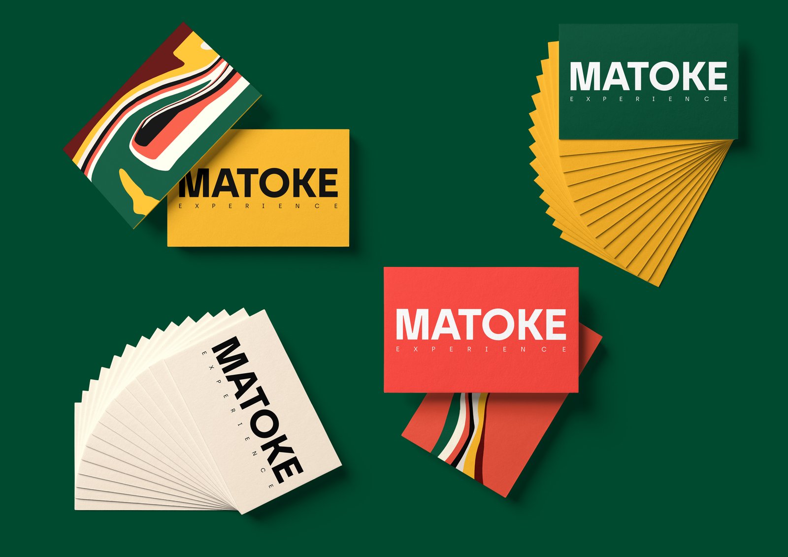
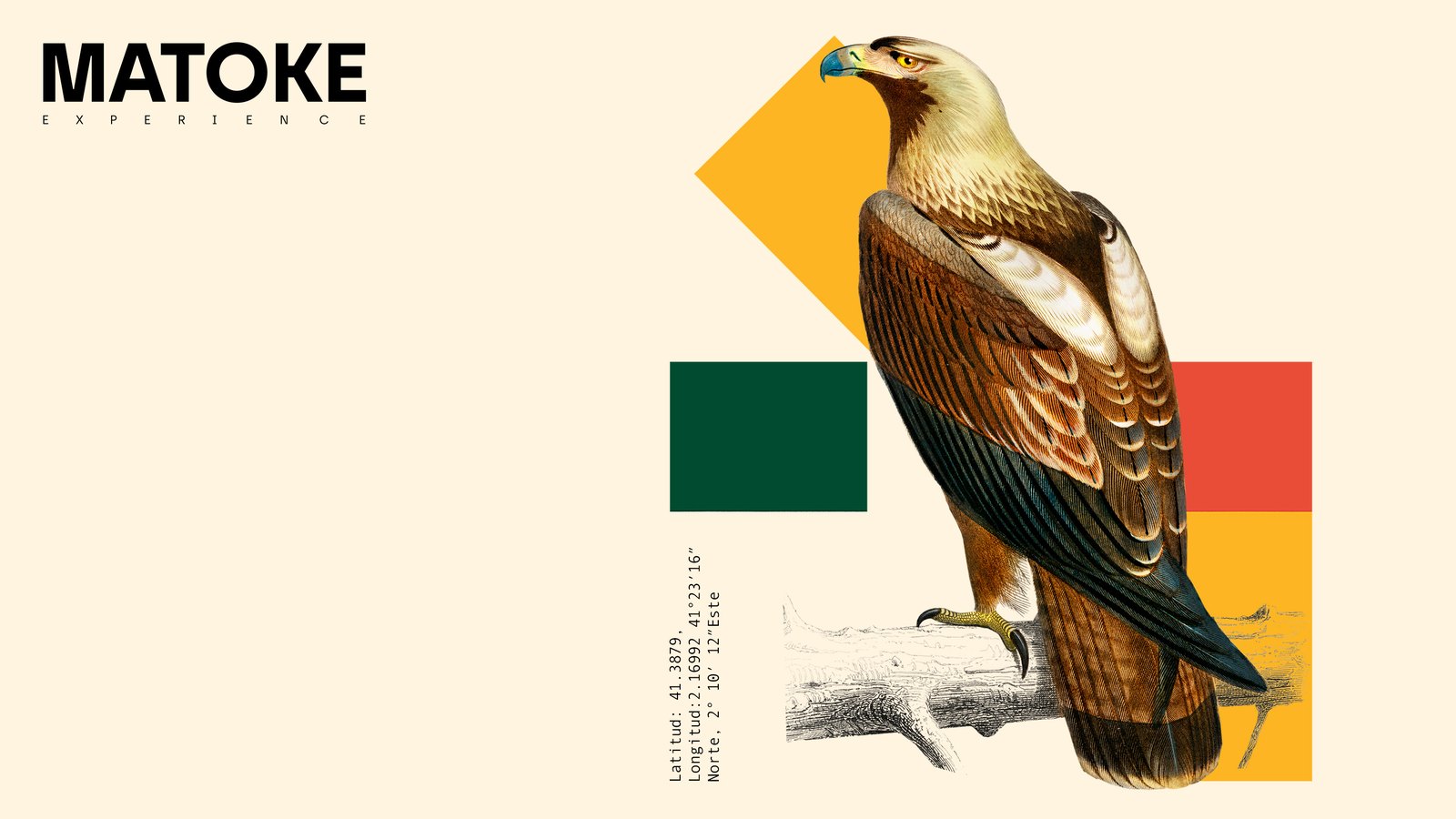
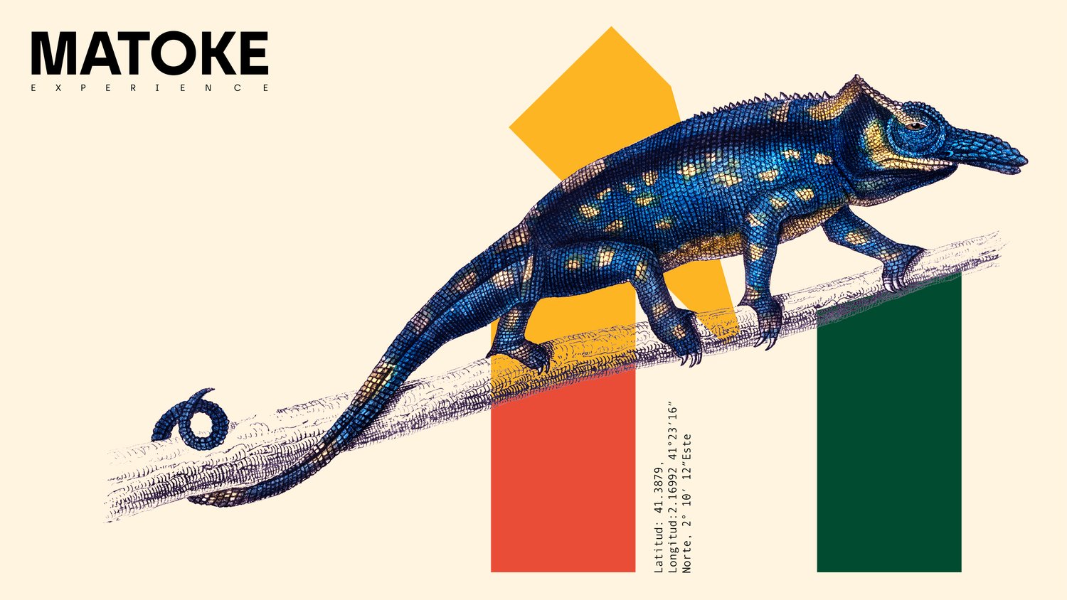
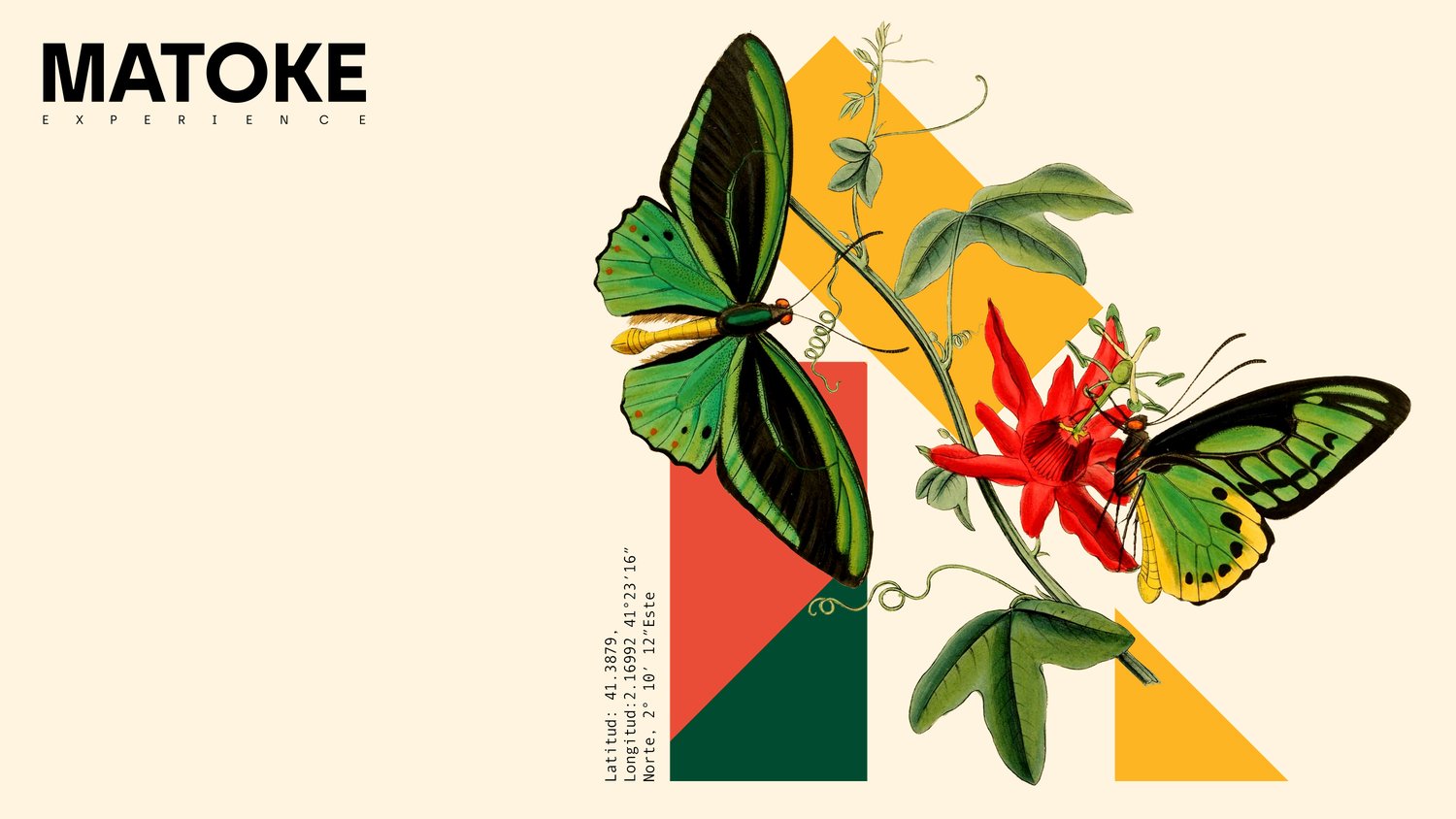
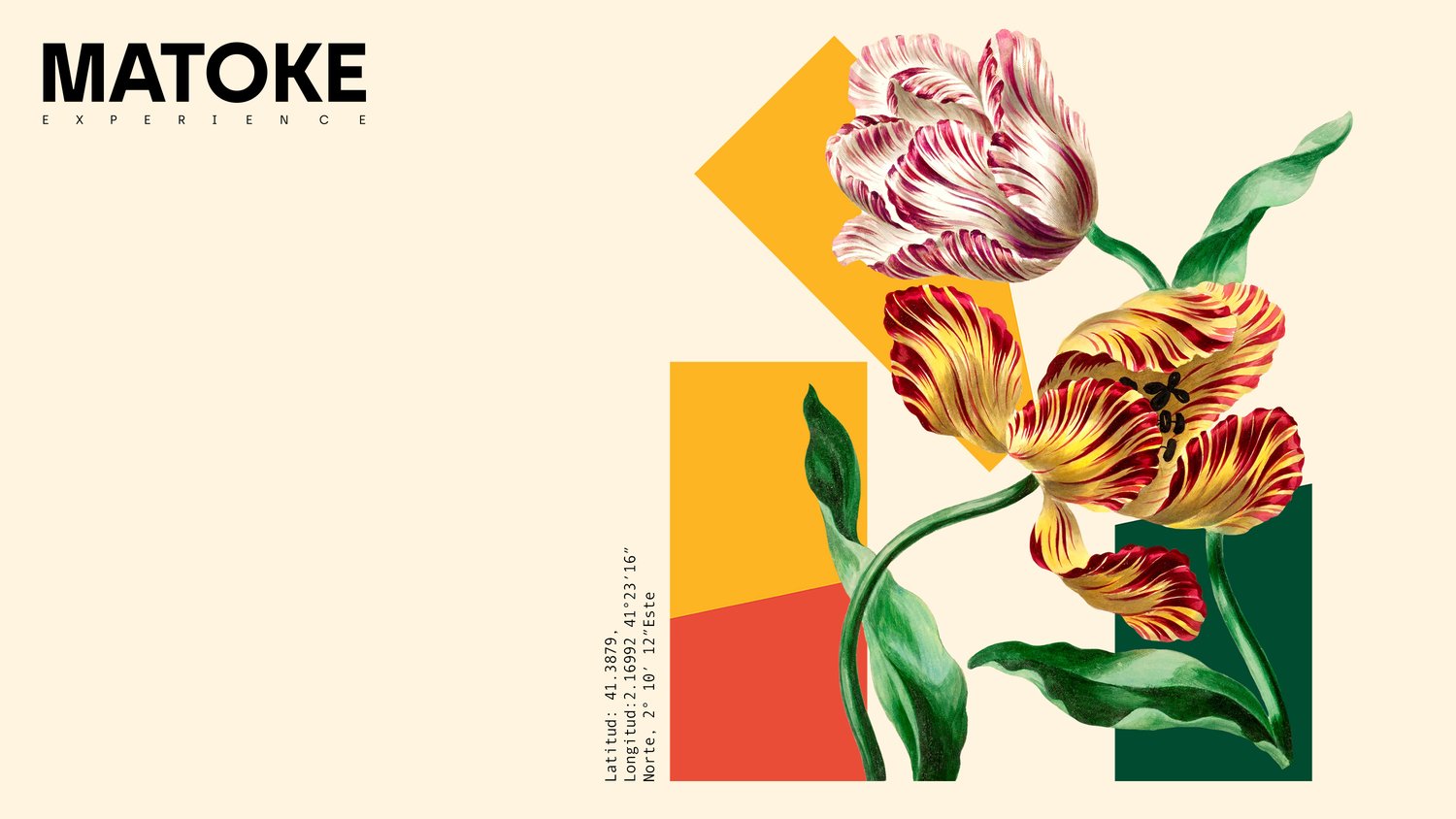
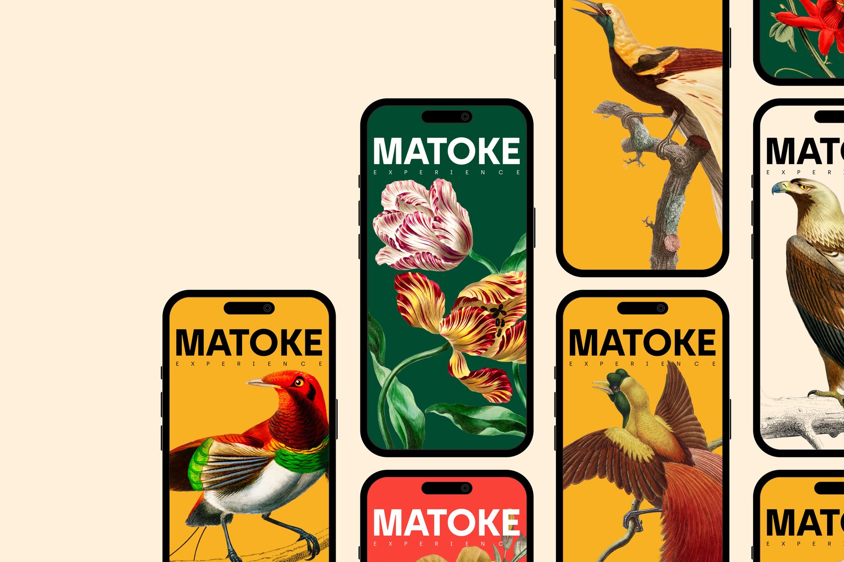
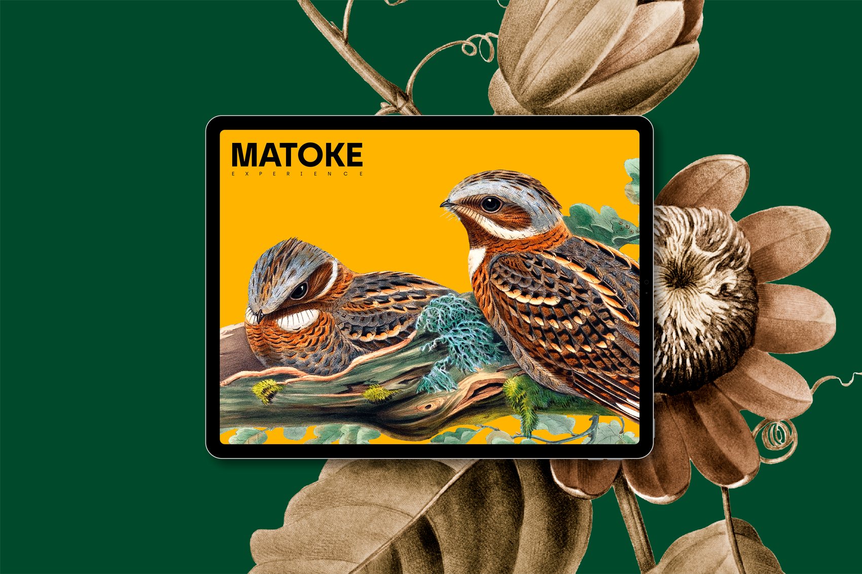
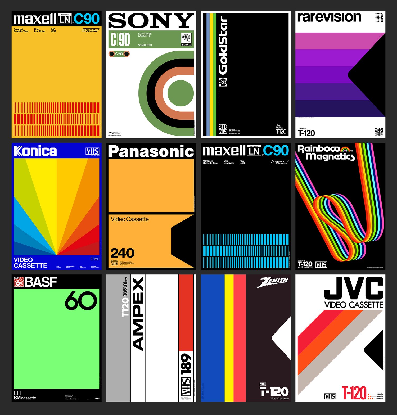
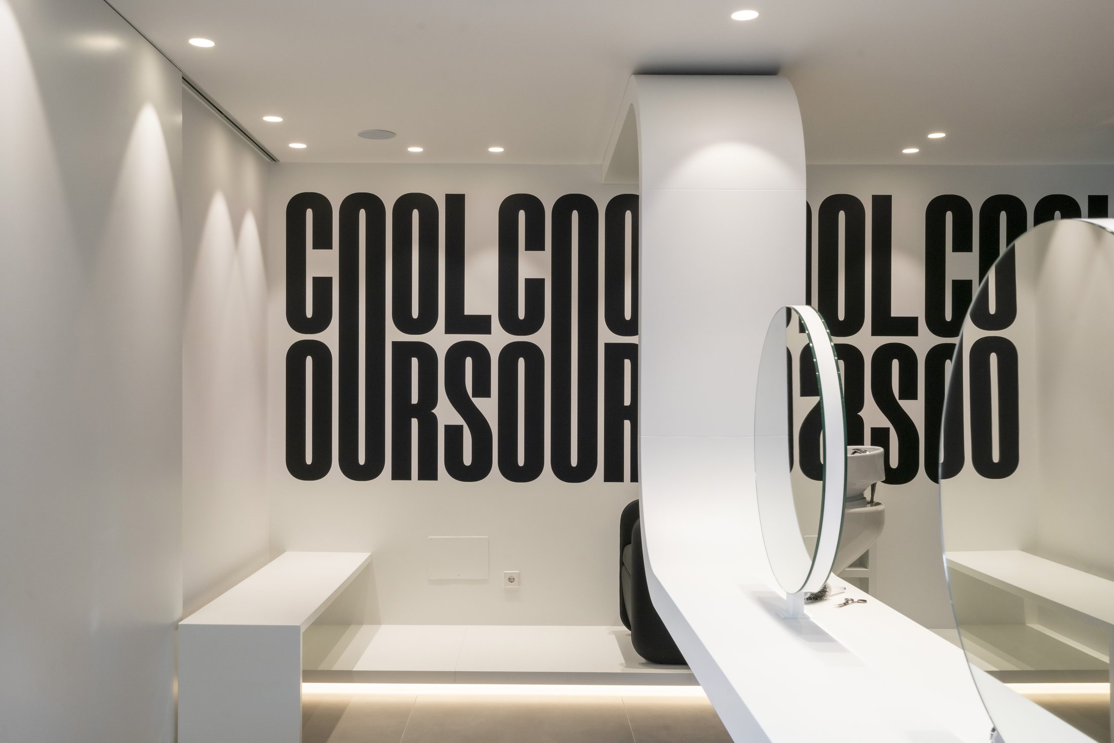
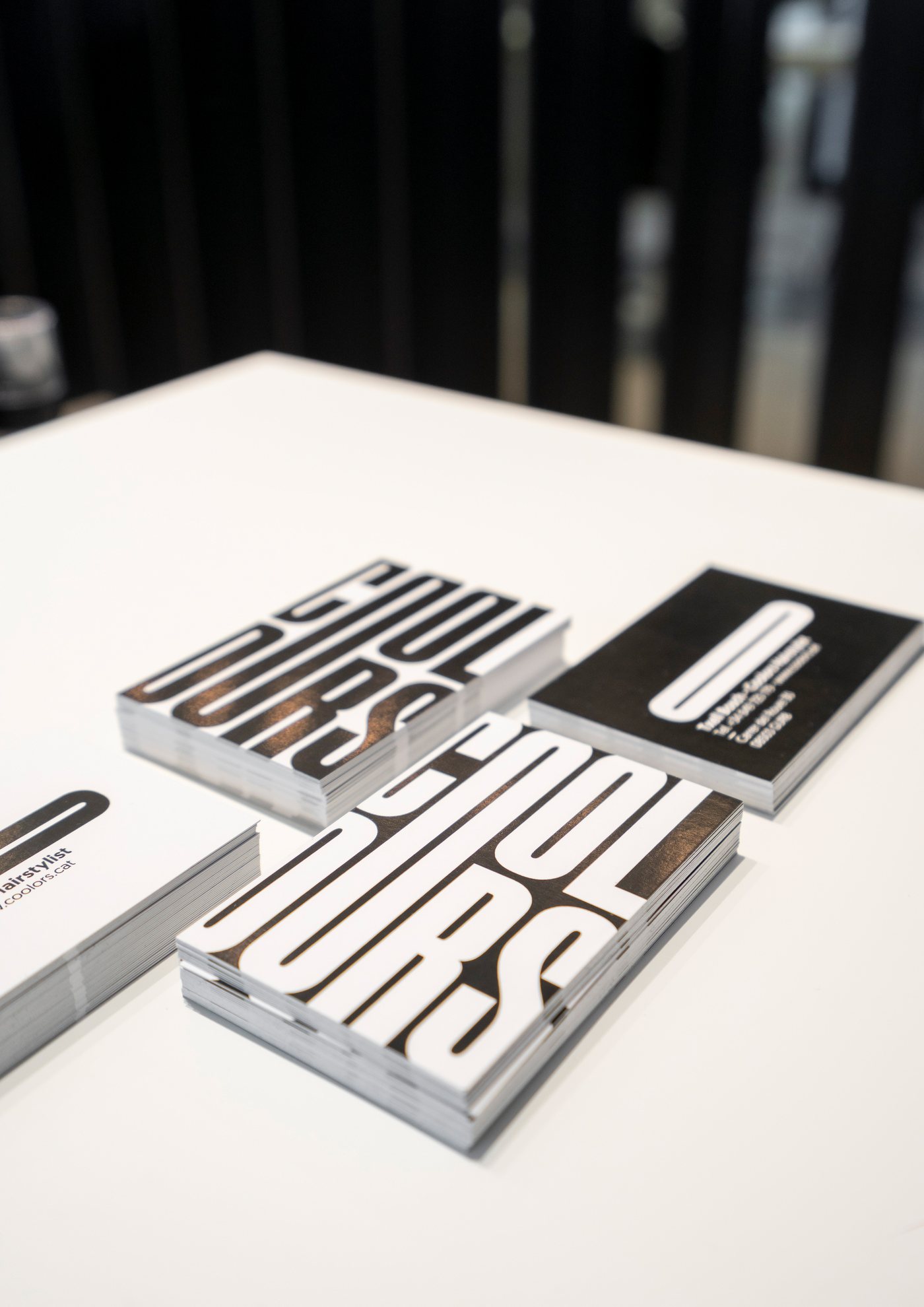
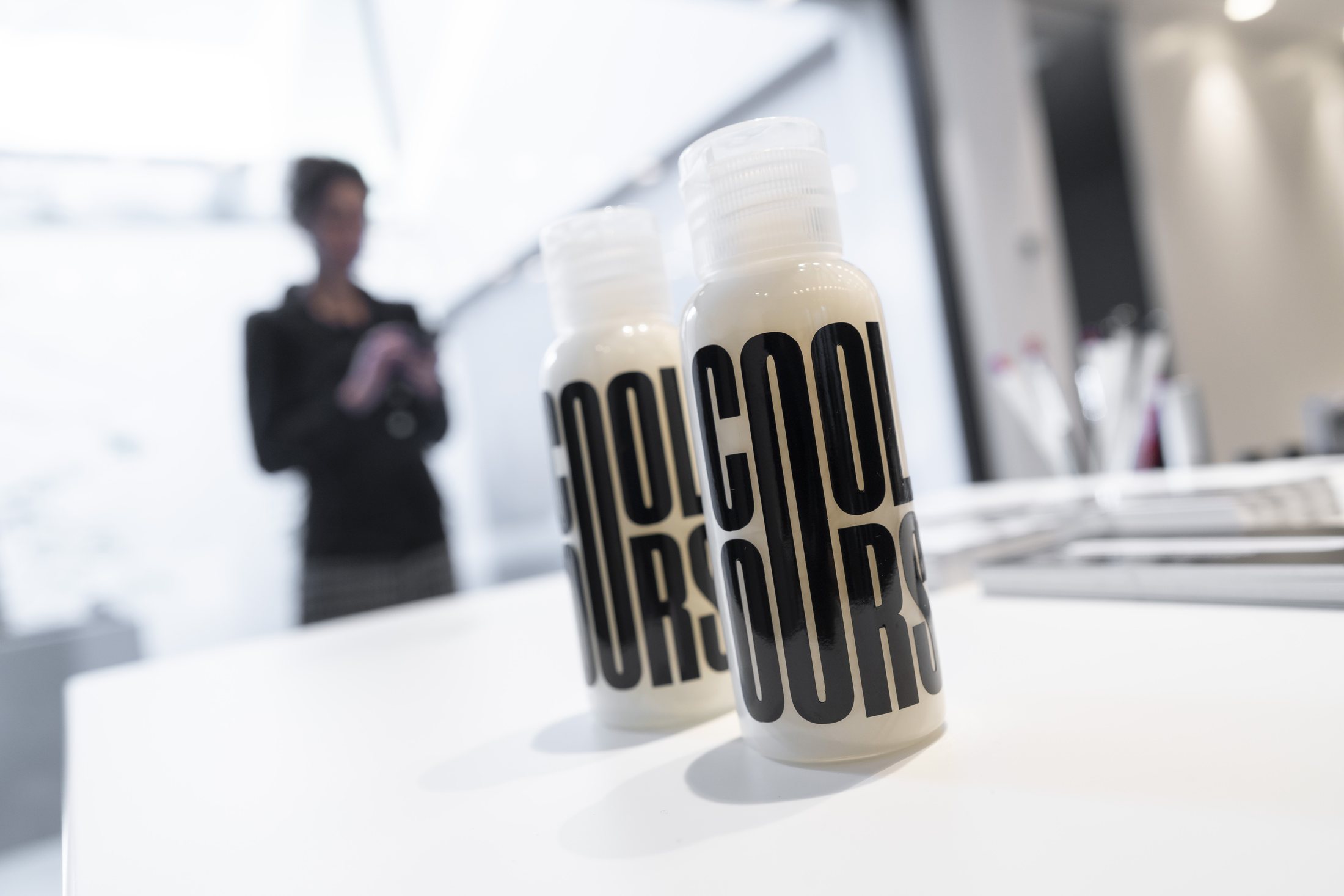
(01) — Selected Work Worldwide · 2011—2026
Coca-Cola Ice Cold Art Direction ↗︎
Tyto PR Brand Identity ↗︎
Tràmit Brand Identity ↗︎
Thewa Brand Identity ↗︎
Kyma Coffee Roasters Branding · Packaging ↗︎
Ice Cream Truck Brand Identity ↗︎
Retro Brands Videotape I Poster Collection ↗︎
Matoke Experience Brand Identity ↗︎
Mamba Brand Identity ↗︎
Retro Brands Videotape II Poster Collection ↗︎
Watecho Naming · Brand Identity ↗︎
Talent for a Better Society Brand Identity ↗︎
100 Years Bauhaus Poster Collection ↗︎
Caravann Brand Identity ↗︎
30th MMVV Poster ↗︎
Glam Hairstylist Brand Identity ↗︎
UEV Centenary Brand Identity ↗︎
Coolors HairstylistBrand Identity ↗︎
(02) — Selected Clients

We make brands
worth more.

Let’s Talk
©2026 All rights reserved · By Xavier Esclusa Trias
01
Coca-Cola Ice Cold
ClientThe Coca-Cola Company
SectorFMCG · Beverages
DisciplineArt Direction · Campaign
LocationAtlanta · United States
Year2017
Brief+
An invitation from Coca-Cola.
Coca-Cola’s design team handpicked twelve of the world’s best designers, Allan Peters, Sawdust, Brock Davis, Design Army, Artiva Design, Emphase among them. The brief: reinvent Ice Cold. One A1 poster. Bold simplicity. The power of red. Work destined for galleries, fashion collections and global digital channels.
Concept+
Motion as temperature.
The Coca-Cola dynamic ribbon reinterpreted as a thermal wave, the moment cold radiates from the bottle. The bottle doesn’t sit in the poster. It generates it. Every composition built from that single energy, expressed through sport, gesture and colour.
Craft+
Eight posters, one system.
Red for heat. Teal for cold. Black for depth. Silhouettes reduced to pure white marks, skater, surfer, diver, gymnast, kite surfer. Human movement inside a thermal composition. No copy. No tagline. Only the Spencerian script, always inside the wave.
Outcome+
Selected alongside the world’s best.
Published alongside Allan Peters, Sawdust, Brock Davis and others across Coca-Cola’s global channels. Featured in Brands Awesome. The brief that asked for feeling, not description, and got both.
Creative Direction
Xavier Esclusa Trias
Twopots Design Studio
Client
The Coca-Cola Company · 2017
02
Tyto PR
ClientTyto PR
SectorPublic Relations
DisciplineBrand Identity · Motion Design
LocationLondon · United Kingdom
Year2025
Brief+
A brand as precise as the work it does.
Tyto PR is an international communications agency built to accelerate high-impact technology companies across Europe. Their PRWithoutBorders model eliminates friction and borders. The brief was clear: no decoration, no convention, no compromise. A system that works as hard as the agency it represents.
Concept+
The owl, distilled.
Tyto refers to a genus of owls, a symbol of wisdom, agility and strategic vision. The isotype is derived from the last two letters of the logotype: T and O, rotated to form an owl’s eye. The brand mark is the concept. The fluid curves embody the dynamism and adaptability of the agency.
Craft+
Built to work everywhere.
The system scales without modification across every format, from favicon to billboard and from email signature to brand film. Motion guidelines were developed alongside the static system from day one, so every touchpoint is considered as part of the same argument.
Outcome+
A system built to scale.
Full brand identity system including primary mark, motion guidelines, colour system, brand guidelines and asset library. Deployed across all European markets.
Creative Direction
Xavier Esclusa Trias
Twopots Design Studio
Client
Tyto PR · 2025
03
Tràmit
ClientTràmit
SectorProfessional Services
DisciplineBrand Identity · Art Direction
LocationBarcelona · Spain
Year2025
Brief+
A trusted firm, finally looking the part.
Tràmit has advised individuals, freelancers and businesses across Catalonia for nearly thirty years, accounting, tax, labor, commercial and legal services built on rigor and a personal approach. The reputation was earned; the identity hadn’t kept pace. The brief was to modernize the brand and make it stand out in a conservative sector, without spending the trust three decades had built.
Concept+
Five services, one mark.
We organized the firm around what it actually does: five areas of service, each with its own color and voice, Labor (orange), Fiscal (yellow), Commercial (red), Legal (green) and Tràmit (blue). The “T” isotype is the point where all five meet: a single symbol that holds the system together and signals that, however specialized the service, it comes from one firm.
Craft+
A system that moves.
We defined a full brand book, typography, palette, iconography and the rules that govern how the five colors behave, and extended it into a poster collection and every corporate and communication touchpoint. The identity is modular by design: the color blocks recombine and resolve into the “T”, which is exactly what animates on the cover.
Outcome+
Built to grow with the firm.
Tràmit gained an identity that scales with the business instead of dating it, flexible enough to absorb new services, coherent enough to read as one brand everywhere. The work reframed a thirty-year track record as something current and confident, and was recognized as a Best of Behance project.
Creative Direction
Xavier Esclusa Trias
Twopots Design Studio
Client
Tràmit · 2025
04
Thewa
ClientThewa
SectorJewelry
DisciplineBrand Identity · Art Direction
LocationBangkok · Thailand
Year2025
Brief+
Spirituality, made tangible.
Thewa makes spiritual bracelets rooted in Mutelu, the Thai belief that amulets, rituals and talismans attract fortune, love, prosperity and health. The brand needed an identity that carried that meaning across an international market without turning literal or generic, anchored in Asian tradition but built to travel.
Concept+
Everything returns to the circle.
We built the system around circularity, the cyclical energy of life, divine connection and protection. The lowercase e sits at the center of the wordmark, its rounded form reading at once as a circle and as a bracelet, the brand’s core object. One letter carrying unity, eternity and connection.
Craft+
A purpose in every stroke.
The monogram fuses three elements into a single mark, the Naka, the Thai dragon-serpent that guards the sacred, the curve of the bracelet for the cyclical nature of the universe, and the letter T that gives it structure and recognition. Around it sits a full system, an ultra-symmetric wordmark and a deep palette of black, signature red, gold, night blue and green, all governed by one geometric logic.
Outcome+
Built to mean, not just to mark.
Thewa gained an emblem rather than a logo, a symbol of power and transcendence for people who look for meaning, balance and beauty in the detail. It reads as international while staying rooted in the tradition that gives it weight.
Creative Direction
Xavier Esclusa Trias
Twopots Design Studio
Client
Thewa · 2025
05
Kyma
ClientKyma Coffee Roasters
SectorSpecialty Coffee
DisciplineBrand Identity · Art Direction
LocationAl Khobar · Saudi Arabia
Year2024
Brief+
Coffee worth slowing down for.
Kyma roasts and serves specialty coffee in Al Khobar, Saudi Arabia, selecting and roasting high quality beans from producing regions around the world. The brief was to build a brand that turned each cup into a sensory journey, refined enough to stand on a vibrant street and own its corner of a fast growing specialty scene.
Concept+
The name is a wave.
Kyma means wave in Greek. It speaks to the fluidity of the flavors and to the undulating movement of the beans during roasting. We made that idea literal in the letterforms, a wordmark built on wave-like curves, so the identity carries the meaning of the name in its own shapes rather than explaining it.
Craft+
From the roast to the letter.
The wave runs through the whole system, from a custom wordmark to packaging, cups and the physical space, paired with botanical illustration and a warm palette of yellow, deep red, olive and black. Every undulation traces back to the same source, the motion of the roast, giving the brand one coherent gesture that reads on a bag, on a façade and on a label without losing itself.
Outcome+
A coffee brand with a signature.
Kyma gained an identity people recognize before they read it, a single visual idea, the wave, that ties product, place and ritual together. It positions a local roaster with the confidence of a brand that knows exactly what it stands for.
Creative Direction
Xavier Esclusa Trias
Twopots Design Studio
Client
Kyma Coffee Roasters · 2024
06
Ice Cream Truck
ClientIce Cream Truck
SectorCreative Agency
DisciplineBrand Identity · Art Direction
LocationSan Francisco · United States
Year2022
Brief+
A studio that refused one lane.
Ice Cream Truck is a full-spectrum creative agency in San Francisco, working across film, live experiences and digital. The brief read like three briefs at once, part magician turning the ordinary into something else, part creator chasing visions into form, part entertainer with a rebel streak. The identity had to carry all of it, serious and playful in the same breath, without flattening into a single tone.
Concept+
Two typefaces, one voice.
The answer lived in the wordmark itself. ICE CREAM is set in a tight, no-nonsense grotesque, the serious half, the part that tells a client these people deliver. TRUCK carries a liquid display cut where the letters curl and melt, the creative half, the part that says they also play. Held together, the two faces let a director, a photographer or a brand lead all see themselves in the same logo.
Craft+
The U that never sits still.
Everything pivots on the U in TRUCK, redrawn as a fluid swirl that the system spins out into a whole language. That single liquid form becomes pattern, becomes garment, becomes the shape the photography is cut into. A loud Pantone palette of cyan, pink, butter yellow and green keeps every surface high energy, while the grotesque half holds the line so it never tips into noise.
Outcome+
One brand, every format.
The identity stretches from a business card to a film title to a full event space without losing its center. It can read serious for a Fortune 500 pitch and absurd for a launch party, sometimes on the same day. Ice Cream Truck ended up with a brand as wide ranging as the work itself, and the project went on to be featured by Behance for both graphic design and editorial craft.
Creative Direction
Xavier Esclusa Trias
Twopots Design Studio
Client
Ice Cream Truck · 2022
07
Retro Brands Videotape I
ClientSelf-initiated
SectorPoster Collection
DisciplinePoster Design · Art Direction
LocationBarcelona · Spain
Year2020
Brief+
The originals were almost there.
The eighties label art that VHS and cassette brands printed on their covers was already strong, confident type, bold color and a clear grid, but it was buried under the visual habits of its time, drop shadows, fake depth and small decorative excesses that dated it. Retro Brands Videotape started from a simple instinct, that this work did not need reinventing, it needed cleaning. The project takes ten posters from nine of those brands, BASF, Scotch, AGFA, Kodak, Polaroid, TDK, Philips, Fujifilm and Sony, and brings each one back to what it was always trying to be.
Concept+
Subtraction was the whole idea.
The method was restraint, not reinvention. Every original kept its proportions, its spacing and its exact typefaces, because that part was already right. What came off was everything that had aged, the shadows, the gloss and the decorative noise. Taking the excess away is what finally let the underlying design breathe. Each poster is the same brand it always was, only honest now about how good its bones were.
Craft+
Removing, never redrawing.
The work was almost entirely subtractive. Shadows stripped, false depth flattened, every redundant effect removed, while the letterforms, the spacing and the color relationships stayed exactly where the originals had placed them. What remains is pure type and pure color on a clean grid, lifted from a small printed label to a full poster. The discipline was knowing when to stop, taking away just enough to reveal the design without ever turning it into something else.
Outcome+
Pure design, still circulating.
The collection has been published widely, from Adobe to Experimenta and Abduzeedo, and years later it still gets shared as an example of pure design and of nostalgia handled with respect. More than a personal exercise, it made a quiet point, that the strongest move a designer can make is often to remove rather than add. Ten posters, nothing added that was not already there.
Creative Direction
Xavier Esclusa Trias
Twopots Design Studio
Client
Self-initiated · 2020
08
Matoke Experience
ClientMatoke Experience
SectorWildlife Travel
DisciplineBrand Identity · Art Direction
LocationBarcelona · Spain
Year2023
Brief+
A naturalist’s eye, turned into a brand.
Matoke Experience is the travel agency of the naturalist Jaume Sañé, built on a simple promise, that you go out and meet the wild up close, the birds, the reptiles, the insects, in the field and not from a coach window. The brief was to give that promise a brand as credible and as alive as the trips themselves, far from the packaged, generic language of group tourism. It had to look like the real thing, because it is.
Concept+
One mark, endless inside.
The identity is built on a single isotype, an M whose outline never changes but whose interior shifts shape, color and texture from one piece to the next, the way the jungle is always the jungle and never twice the same. That one rule, a fixed frame holding a living inside, became the engine of the whole system. The palette comes straight from that world, a warm yellow, a deep red, a forest green and a soft cream, vivid where the wildlife is vivid and grounded where the field is real.
Craft+
The animals are the promise.
The work pairs the clean wordmark with a collection of natural history plates, a toucan, a snake, a king vulture, a beetle, birds of paradise and more, the real creatures a traveler can expect to meet with Jaume in the field. Set over the brand’s geometric color blocks and tagged with field coordinates, each poster reads like a sighting logged on a real expedition rather than a stock image of adventure. Shown together as a grid, they become the catalogue of encounters the trip actually delivers, not the usual packaged tour.
Outcome+
Expert, wild, and featured.
The result is one coherent world, a mark that mutates like its habitat, a palette, a pattern, a full poster collection and its applications, all speaking the same language. Featured on Behance for both graphic design and editorial craft, the identity reads expert without turning cold and wild without turning decorative, ready to front everything from a field expedition to a phone screen. A brand that promises a real encounter with the wild, and looks like it keeps the promise.
Creative Direction
Xavier Esclusa Trias
Twopots Design Studio
Client
Matoke Experience · 2023
10
Retro Brands Videotape II
ClientSelf-initiated
SectorPoster Collection
DisciplinePoster Design · Art Direction
LocationBarcelona · Spain
Year2024
Brief+
One collection was not enough.
Retro Brands Videotape began as a set of ten posters, and the response made something clear, the eighties video aisle held far more design worth recovering than a single collection could carry. This second volume widens the shelf with AMPEX, Konica, BASF, GoldStar, Maxell, Sony, Panasonic, Zenith, Rainbow Magnetics, Rarevision and JVC. The instinct is the same as before, these labels were never weak, they were only dressed in the visual habits of their decade, and underneath each one sat confident type and color waiting to stand on its own.
Concept+
Same rule, a wider shelf.
Nothing about the method changed, because the method was the point. Each label keeps its proportions, its spacing and its original typefaces, the parts that were already right. What comes off is everything that aged, the gloss, the false depth and the small decorative habits of the time. This volume is the idea tested at scale, the same discipline applied to a new set of brands, proof that the approach was a system and not a single lucky exercise.
Craft+
Subtract, then enlarge.
The work stays subtractive. Effects are stripped, surfaces flattened and every redundant flourish removed, while the letterforms and color relationships hold exactly where the originals placed them. Each design is then lifted from a small printed sleeve to a full A-format poster, where its underlying structure finally has room to breathe. Twelve covers, one consistent treatment, each one cleaned rather than redrawn.
Outcome+
The system held.
The second set confirmed what the first had suggested, that the strongest move a designer can make is often to remove rather than add. The work keeps circulating as a reference for clean design and for nostalgia handled with respect, and across both volumes it reads as one body of work rather than two separate exercises. Twelve more posters, nothing added that the originals had not already earned.
Creative Direction
Xavier Esclusa Trias
Twopots Design Studio
Client
Self-initiated · 2024
09
Mamba
ClientMamba
SectorPlumbing, HVAC & Renewables
DisciplineBrand Identity · Art Direction
LocationBarcelona · Spain
Year2021
Brief+
Hard trades, one sharp mark.
Mamba installs the systems a building runs on, plumbing, heating, electricity, air conditioning and renewable energy. The brief was to turn a broad, technical, unglamorous set of trades into one brand with personality and bite, something a homeowner and a contractor would both trust and remember. The client arrived with a single firm condition, the name Mamba had to stay tied to the black mamba itself, one of the fastest and most feared snakes, and that energy had to live in the mark without tipping into a literal animal logo.
Concept+
One mark, two readings.
The idea lives in a single move. We stretched the B of the name into two long parallel lines, the body of the snake, that close into the bowl of the letter at the end, so the mark reads as the name and the animal at once. A clean and laconic sign that says Mamba and shows the mamba in one stroke. That double meaning became the fixed asset of the whole system, the form everything else is built around.
Craft+
Black, white, and tool orange.
The palette is deliberately tight, two achromatics, black and white, plus one chromatic, an orange close to the exact tone of the tools and equipment these trades run on. That single hot color does the heavy lifting, it signals work, energy and safety, and it makes the mark unmistakable across a van, a folder, a business card or a screen. Everything is drawn to stay legible and confident at any size, from a stamped sign to a full vehicle livery.
Outcome+
Memorable, and built to work.
The result is a corporate identity that is memorable, universal and functional, expressive enough to stand out in a crowded trade and disciplined enough to apply anywhere. One sign carries the whole company, the name and the animal in a single form, sharp where the work is sharp and clear where it has to be. Featured on Behance for graphic design and editorial craft, it is a brand with the speed and bite of its namesake, doing a plain job with real character.
Creative Direction
Xavier Esclusa Trias
Twopots Design Studio
Client
Mamba · 2021
13
100 Years Bauhaus
ClientSelf-initiated
SectorCultural Tribute
DisciplinePoster Collection
LocationBarcelona · Spain
Year2019
Brief+
A hundred years of the modern.
The Bauhaus, founded by Walter Gropius in Weimar in 1919, was the school that taught the twentieth century how to see. Its idea was radical and simple, to bring every art together into one total work, the Gesamtkunstwerk, where architecture, design, typography and craft would finally speak the same language. The brief here was a tribute, a poster collection marking the centenary of a school that lasted only fourteen years and shaped design for the next hundred.
Concept+
Honor the system, not the nostalgia.
The temptation with Bauhaus is to quote it, to borrow the primary colors and the geometry and call it a homage. The concept went the other way. Rather than imitate the look, the collection honors the method, the belief that form follows a system, that color and shape carry meaning, that nothing on the page is accidental. Each poster is built the way the school taught, structure first, decoration never.
Craft+
Geometry, color, and discipline.
The pieces are made from the Bauhaus vocabulary used with restraint, the circle, the square and the triangle, the primary palette, the grid that holds everything in tension. Type and shape are treated as one material. The craft is in the discipline, knowing what to leave out, letting a single diagonal or a block of color do the work that a lesser hand would crowd.
Outcome+
A school that never stopped teaching.
The Bauhaus existed for fourteen years and has never stopped influencing art, architecture, graphic and industrial design and typography. These posters are a small return on that debt, a contemporary salute built on its own principles rather than its surface. The collection found its audience beyond the studio, featured on Behance and picked up by international design press, proof that the school still speaks to the people it taught to look.
Creative Direction
Xavier Esclusa Trias
Twopots Design Studio
Client
100 Years Bauhaus · 2019
14
Caravann
ClientCaravann Consulting, LLC
SectorStrategy & Executive Coaching
DisciplineBrand Identity
LocationBerkeley · United States
Year2023
Brief+
A consultancy that moves clients forward.
Caravann Consulting is a strategy and executive coaching firm in Berkeley, California, built to help other companies reach their business goals. The brief was to give that purpose a face, an identity that feels like progress itself, modern with a vintage touch, serious enough for the boardroom and warm enough to trust. Not a logo that sits still, but one that suggests a journey already in motion.
Concept+
The brand is the road.
Everything starts from a single idea, the journey toward success, the path walked alongside the client. That metaphor runs through the whole system. The typography, Awards Display, was chosen for the tail of its R, which reads like a road bending into the distance. The lines that structure the identity are drawn from that same road, so the brand never just names the destination, it shows the way there.
Craft+
Warm and cool, close and serious.
The palette does the emotional work, warm tones for closeness and trust, cool tones for professionalism and seriousness, held in balance so the brand feels human without losing authority. The shapes and details are deliberately distinctive, modern lines with a vintage memory, so the mark stays recognizable and stays in the mind. Nothing decorative, every element carrying a piece of the meaning.
Outcome+
A distinctive map for a serious firm.
The result is an identity that turns an abstract promise, we will get you there, into something you can see and feel. The journey reads in the letterforms, the lines and the color, giving a strategy and coaching consultancy an image that is modern, memorable and unmistakably its own, a brand that looks like the path it helps its clients travel.
Creative Direction
Xavier Esclusa Trias
Twopots Design Studio
Client
Caravann Consulting · 2023
15
30th MMVV
ClientMercat de Música Viva de Vic
SectorMusic Industry Festival
DisciplineIdentity · Poster · Campaign
LocationVic · Spain
Year2018
Brief+
Thirty editions, one living market.
The Mercat de Música Viva de Vic reaches its thirtieth edition, the meeting point of the music industry in a Catalan city for four days every September since 1989, where programmers, labels, agencies and the public all converge. The brief was not to design a poster. It was to build one image strong enough to hold across dozens of applications, from urban banners and stage backdrops to screens, press, outdoor, television and digital. It had to be immediate, recognizable and powerful, a simple system yet distinctive enough to stay solid at every format and scale, and to honour three decades without sliding into nostalgia.
Concept+
The number that dances.
Thirty years of live music is not a monument, it is movement. The concept turns the 30 into a living element and lets a female figure, caught mid leap, carry energy and celebration through a highly structured typographic composition. On a second level the gesture is a tribute to all the women who made the festival possible across the decades, because without them MMVV would not exist as it does today. The institutional and the human share the same image, holding tension, rhythm and a clearly contemporary voice.
Craft+
One colour, one cut, full voltage.
A single intense orange does the work of instant recognition, loud enough to own a wall in the street and disciplined enough to carry a programme. The numerals are set in a high contrast serif whose thick and thin strokes give the 30 an editorial elegance against the raw energy of the figure. The composition stays minimal on purpose, so impact is maximised at every size. From street banner to stage backdrop, the identity keeps the same strength, recognition and coherence.
Outcome+
A system built to outlast the edition.
The image moved from large format banners across Vic to stage, press, television and the festival full digital presence, holding its force at every size. It marked the thirtieth edition as a moment rather than another year on the calendar, and gave the professional and public sides of the event a single, confident face. More than a poster, it became a flexible visual identity system designed to last well beyond one edition, as current as the music it announced.
Creative Direction
Xavier Esclusa Trias
Twopots Design Studio
Client
Mercat de Música Viva de Vic · 2018
16
Glam Hairstylist
ClientGlam Hairstylist
SectorHair & Beauty Salon
DisciplineNaming · Brand Identity · Campaign
LocationBarcelona · Spain
Year2019
Brief+
Modern, and unmistakably a salon.
Glam Hairstylist opened in the center of Barcelona as a unisex salon, a wide, calm space for a cut, a color or your nails. It needed a brand that felt modern and a little daring, and that announced exactly what it was the moment you saw it.
Concept+
Hair plus comb plus G.
The answer lived inside the name. A lock of hair, a comb and the letter G collapse into a single mark, Hair plus Comb plus G equals GLAM. Typography carries the rest, a direct, confident voice that reads as a salon before you read a single word.
Craft+
Built on the power of type.
The system is built on the power of type. The wordmark and the comb-G mark lead, clean and bold, and run across signage, print and the launch campaign, so the salon speaks with one clear voice throughout.
Outcome+
A grown-up presence, featured twice.
A new salon arrived with a grown-up, unmistakable presence in a competitive local market, and the identity was featured twice on Behance, in Graphic Design and in InDesign.
Creative Direction
Xavier Esclusa Trias
Twopots Design Studio
Client
Glam Hairstylist · 2019
17
UEV Centenary
ClientUnió Esportiva de Vic
SectorFootball Club
DisciplineBrand Identity · Poster
LocationVic · Spain
Year2022
Brief+
More than an anniversary poster.
Unió Esportiva de Vic turned one hundred, and the commission was a single commemorative poster. We saw something larger. A centenary is not a date, it is a hundred years of people, so we proposed not an image for one season but an identity the club could make its own and carry forward.
Concept+
The captain’s armband, an endless ribbon.
We asked supporters for one word to define what the club meant to them: movement, history, force, flag, pride, dedication, glory, dream, future. The club is the sum of all of them. We needed a single sign able to hold them, and we found it in the captain’s armband, the object passed from one captain to the next, season after season, across a century. We drew it as a ribbon with no beginning and no end that, folding over itself, forms a 100. That infinite ribbon is the whole idea, the relay that never breaks between the people who were, are and will be Unió Esportiva de Vic.
Craft+
From one ribbon, a whole system.
We did not want a fixed logo but a system. The shape of the 100 stretches, turns and reconfigures without losing its reading, which let us carry it from the poster to audiovisual pieces and to the team’s own equipment. A dynamic identity, made to move and timeless by construction, so the centenary reads as a starting point and not a finish line.
Outcome+
A hundred years, made to last.
The ribbon gave the club a language of its own for every touchpoint, the same idea from the kit to its communications. The project was featured by Behance in Graphic Design and InDesign, and Print Magazine published a piece on how the poster marked a hundred years of the club. What began as a single commissioned piece became the visual foundation of the whole anniversary.
Creative Direction
Xavier Esclusa Trias
Twopots Design Studio
Client
Unió Esportiva de Vic · 2022
18
Coolors Hairstylist
ClientCoolors Hairstylist
SectorHair Salon
DisciplineBrand Identity · Naming
LocationBarcelona · Spain
Year2019
Brief+
Modern, daring, different.
Coolors is a unisex salon in the center of Barcelona, a wide, calm space where you go to switch off, get a cut or have your nails done. The brief asked for an identity to match the place, modern, daring and a little different, with a name strong enough to carry the whole brand on its own.
Concept+
Cool and colors, one word.
The idea is a single move. Cool and colors fold into Coolors, one word that says fashion, color and the easy confidence of a good salon in a single read. It points to the whole world of the stylist, the trends and the chair, without needing to explain itself.
Craft+
Let the typography speak.
We built the identity on type. The message is direct and clear, the wordmark set so it reads at a glance and holds from the storefront to a card. Color comes in as a nod to the name, a flexible system that stays playful without losing its clean, confident base. Nothing decorative that the word does not need.
Outcome+
A name you remember.
Coolors ended up with an identity as direct as its promise, easy to recognize and easy to use across the salon. The project was featured by Behance in Graphic Design. One word, built on typography, that tells you what kind of place this is before you walk in.
Creative Direction
Xavier Esclusa Trias
Twopots Design Studio
Client
Coolors Hairstylist · 2019
09
Brand Identity
FEH Brand Identity
A national federation, redesigned.
ClientFEH
ScopeBrand Identity
Year2025
Brief+
Coming soon.
Case study in preparation.
Concept+
Coming soon.
Case study in preparation.
Craft+
Coming soon.
Case study in preparation.
Outcome+
Coming soon.
Case study in preparation.
Creative Direction
Xavier Esclusa Trias
Twopots Design Studio
11
Watecho
ClientWatecho
SectorSpiritual Experience
DisciplineNaming · Brand Identity
LocationHua Hin · Thailand
Year2026
Brief+
Not a retreat, a return.
Watecho is a mindful travel experience in Thailand, based in Hua Hin, that brings together meditation, cultural discovery, nature and deep inner listening. At its center is practice guided by Theravāda Buddhist monks, the oldest living lineage of Buddhism, who still meditate exactly as it was done at the source, more than two and a half thousand years ago. Around that turn the visits to sacred temples and natural settings, the seaside rest, the conscious movement and the Thai food, with room left for silence. The brief was never to design another wellness retreat. It was to give form to a journey that lets a traveller discover a country, a culture and, along the way, themselves.
Concept+
Wat and echo, temple and return.
The name carries the whole idea. Watecho joins Wat, the Thai word for temple, with Echo, the sound that returns, so the brand reads as presence and inner return at once. From there the CO became a symbol in its own right, a mark for sound, resonance and the slow evolution of awareness. The C holds the moon, calm, intuition and inner listening, while the O holds the sun, clarity, vitality and conscious presence. Read together, CO works as a meditative sign that begins within and expands outward.
Craft+
Thai forms, a living palette.
The visual language grows from Thailand itself. The typography takes its cues from Thai letterforms, keeping their rhythm while speaking in a contemporary voice, tradition and present tense in the same word. The identity is multicolored on purpose, each color drawn from the landscapes, the sea, the natural elements and the energies of the journey, so the system feels alive rather than corporate. Everything resolves around the CO symbol, the still point the rest of the brand moves around.
Outcome+
A brand you can sit with.
Watecho ends up being two things at once, a travel experience and a small meditative symbol, and that is the point. The naming, the mark and the palette let it stand apart from the usual retreat language, calmer, warmer and more rooted in place. It invites the traveller in the way the experience itself does, beginning quietly within and opening outward to a country, a culture and a clearer sense of self.
Creative Direction
Xavier Esclusa Trias
Twopots Design Studio
Client
Watecho · 2026
12
Talent for a Better Society
ClientTalent for a Better Society
SectorEducation Foundation
DisciplineLogo · Brand Identity
LocationBarcelona · Spain
Year2021
Brief+
Talent, gathered into one mark.
Talent for a Better Society is a foundation that gathers high capacity people who want to change the world, with education as its first lever, a new approach built to reshape the society of the future. The brief was to give that mission a face, an identity simple enough to travel anywhere and clear enough to stand for something larger than itself, the belief that talent, brought together, builds a better society.
Concept+
Three talents, one letter.
The mark works the way the foundation does, by bringing parts together. The imagotype is made of three elements, each standing for a kind of talent a person carries. The base element holds potential talent, the middle element holds hidden talent, and the top element holds natural talent. Interlocked, the three form a T, the first letter of the name and a sign of people with different gifts uniting around a shared purpose.
Craft+
Plain on purpose, built to repeat.
The symbol was resolved to be plain in the best sense, understood at a glance, recognized once seen and easy to reproduce at any size or in any medium. Nothing decorative survives that does not carry meaning. Each of the three elements keeps its own weight while serving the whole, so the mark reads first as a confident T and then, on a second look, as three talents held together.
Outcome+
One mark, the whole idea.
The result is a single sign that carries the foundation values without needing to explain them, talent, formation and the union of different people around education. Built from three parts yet read as one letter, the imagotype gives Talent for a Better Society a face that is easy to recognize, easy to use and clear about what it stands for, a foundation assembling capable people to shape the society that comes next.
Creative Direction
Xavier Esclusa Trias
Twopots Design Studio
Client
Talent for a Better Society · 2021
Click to email
00
Twopots Design Studio
Founded2011
BasedBarcelona · Southeast Asia
ReachEurope · MENA · Asia · USA
PracticeStrategy · Identity · Campaigns
RecognitionClio · White Square Jury
Approach+
Strategy and craftTwopots is an independent branding and creative direction studio. We help ambitious companies create brands people remember, trust and choose. By combining strategy, identity, creative direction and digital experiences under one roof, we ensure every decision supports a clear business objective and a stronger market position. We don't create disconnected assets. We build coherent brand systems designed to increase perceived value, support growth and remain relevant over time.
Capabilities+
Brand StrategyPositioning, brand architecture, naming and consulting.
Brand IdentityVisual identities, design systems and brand guidelines.
Creative DirectionCampaigns, launches, communication systems and content.
Digital ExperiencesWebsites, digital products and online brand experiences.
ProductionPackaging, editorial, motion and print.
AI-Driven ProductionAI pipelines that accelerate output while protecting craft.
Recognition+
Clio AwardsInternational Jury, 2020.
White Square FestivalInternational Jury, 2021.
PressFeatured 80+ times on Behance, plus Abduzeedo, Print Magazine, Experimenta, Inspiration Grid and Brands Awesome, among others.
Selected Experience+
Track Record200+ projects delivered across Europe, the Middle East, Asia and the United States.
ClientsCoca-Cola, Cartier, Tyto PR, and brands across hospitality, lifestyle, healthcare and technology.
BaseFounded in Barcelona, working worldwide.
Let’s Talk Let’s Talk Let’s Talk Let’s Talk
StudioBarcelona · Southeast Asia