Tyto PR Brand Identity
Advertising, BrandingTyto PR Brand Identity
Tyto PR Brand Identity
Tyto PR is an international communications and public relations agency designed to accelerate the growth of high-impact technology companies across Europe.
With its innovative PRWithoutBorders™ model, the agency eliminates inefficiencies and barriers, enabling seamless collaboration and delivering impactful results that foster innovation and success.
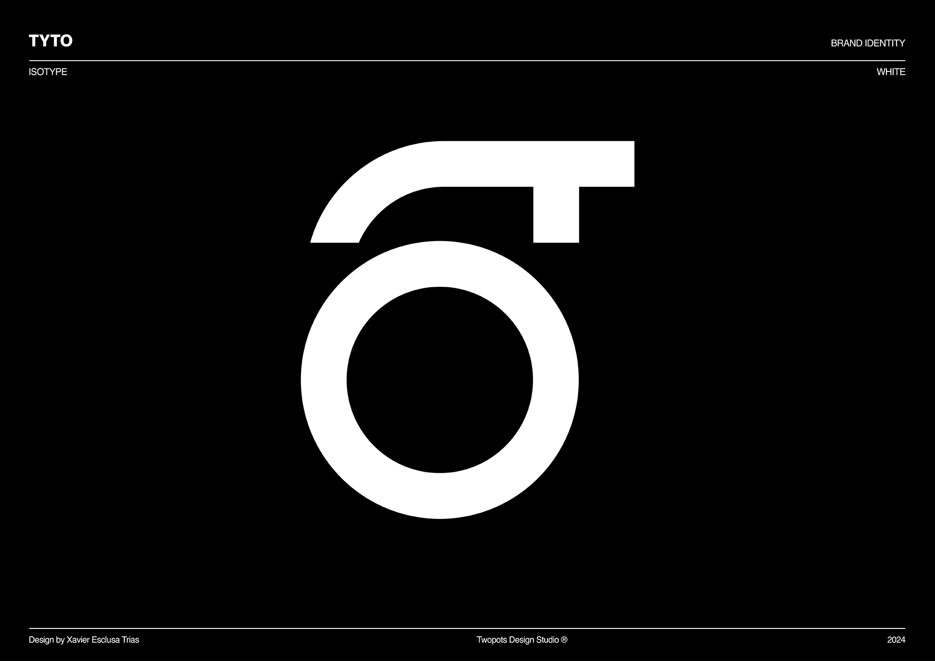
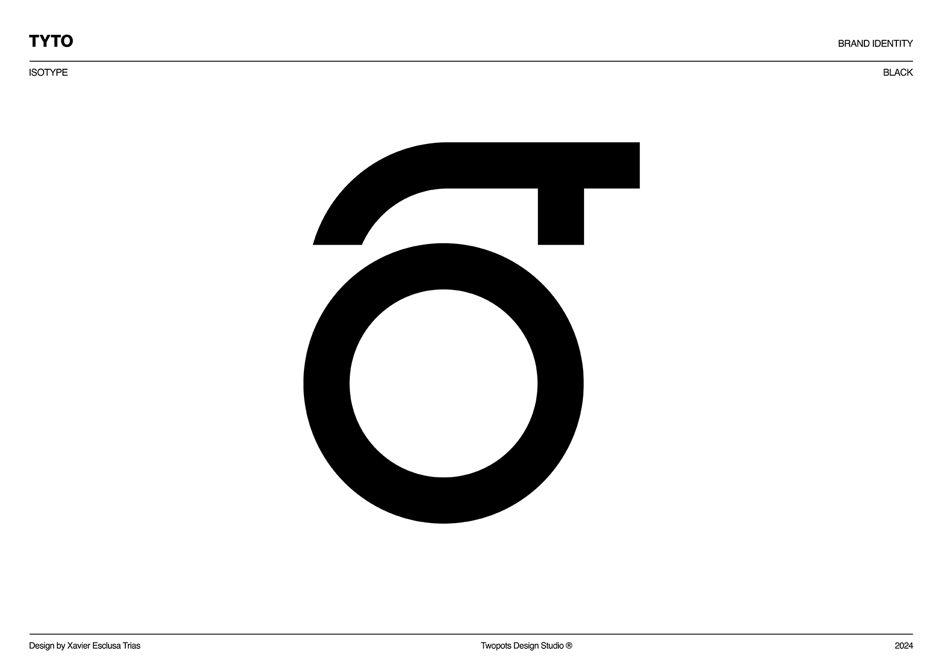
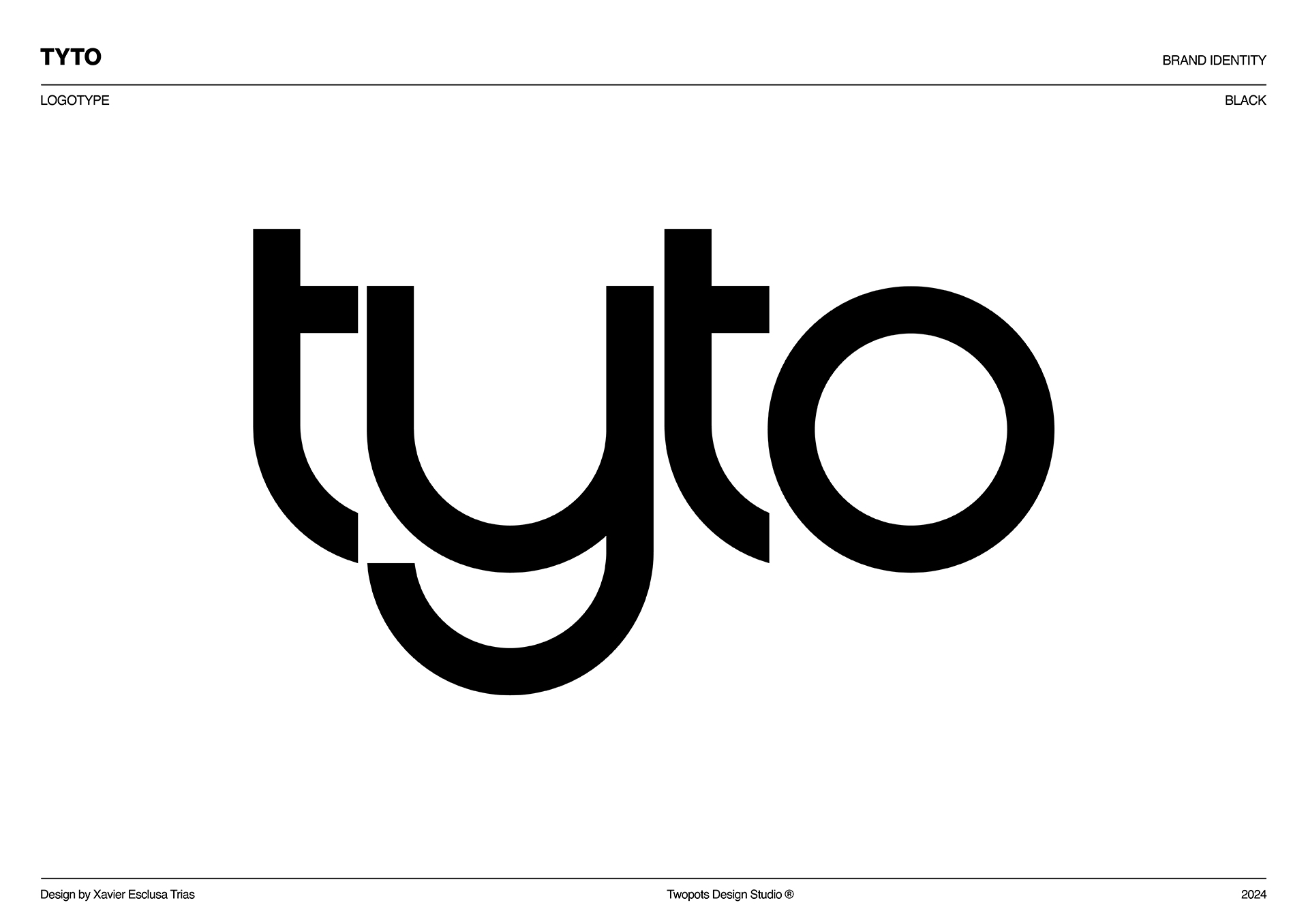
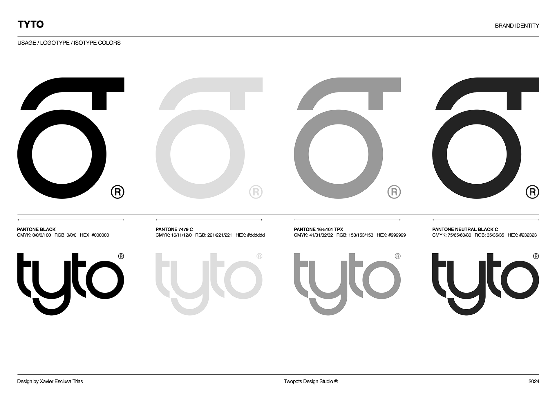
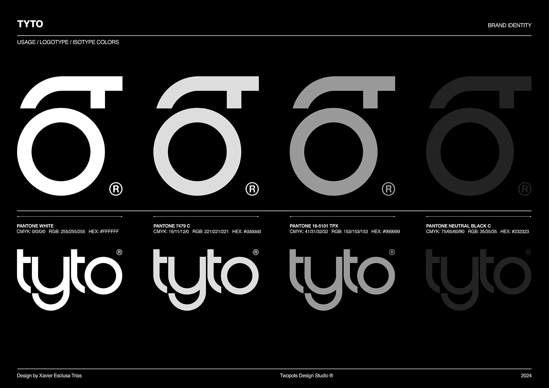
The logo of Tyto PR is a direct reflection of the brand’s essence and mission. Drawing inspiration from the word “Tyto” which refers to a genus of owls, symbolizing wisdom, agility, and strategic vision the design incorporates these qualities in a unique way. The isotype is derived from the last two letters of the logotype: the “T” and “O” which are rotated to form the shape of an owl’s eye.
This subtle transformation emphasizes the brand’s ability to observe, analyze, and navigate complex environments with precision and insight.
The fluid curves and minimalist design of the logo embody the agency’s dynamism and adaptability, values that drive its forward-thinking approach. The logo is not just a visual identifier; it’s a seamless representation of the company’s principles: creativity, clarity, and a vision that transcends conventional boundaries.
In essence, the Tyto PR logo communicates the brand’s commitment to empowering clients with relevant, impactful, and globally resonant messages, encapsulating both its mission and its identity.

